
Gallery Wall Dining Room: Stylish Layouts & Tips
Key Takeaways
- Choose a layout that fits your room: crisp grids, mirror-centered balance, or organic mixes work beautifully in dining rooms;
- Follow reliable height and spacing rules: center at 57–60 inches from the floor and use 2–3 inches between frames for a clean look;
- Curate photos and art by color story and mood so your gallery wall dining room feels cohesive and personal;
- Install without nails using Mixtiles’ peel-and-stick frames, then rearrange anytime without damage to your walls.
A gallery wall can transform a dining room from nice to memorable in one afternoon. Whether your style is classic, modern, or eclectic, the right layout, height, and mix of frames will bring the space together. In this guide, you will learn dining-room formulas that remove guesswork, plus renter-friendly installation tips. And because Mixtiles frames are adhesive and repositionable, you can design, hang, and tweak your layout without tools or wall damage.
Ready to design your dining room gallery wall? Explore our gallery walls for inspiration, then create your own custom photo tiles to get peel-and-stick frames delivered.
Why create a gallery wall in my dining room?
There are practical and emotional reasons to put a gallery here:
- Sets the mood where you gather: warm, personal, and conversation-worthy;
- Works with any footprint, from a small breakfast nook to a formal dining room;
- Flexible styling: symmetrical grids for polish, organic clusters for a relaxed look;
- With Mixtiles, you can update art or family photos without re-drilling.
How high should a dining room gallery wall hang?
The sweet spot puts the visual center at comfortable eye level. Aim to center the composition at 57–60 inches from the floor, then adjust slightly for furniture height and traffic patterns in your space.
Above a buffet or console
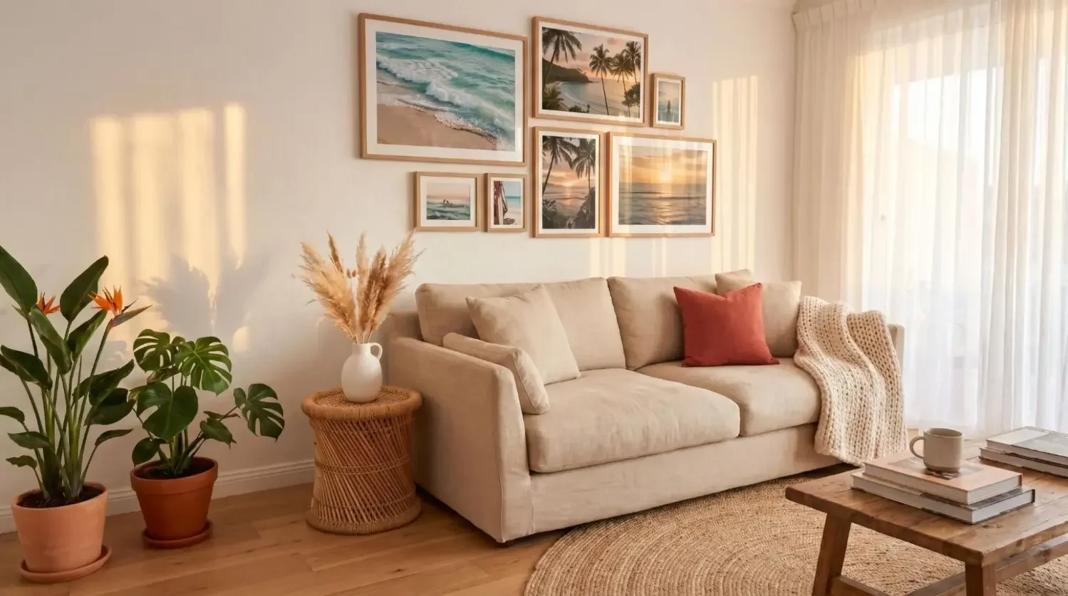
Leave 6–8 inches between the top of the furniture and the bottom of your lowest frame so the grouping feels grounded rather than crowded. Keep the visual center around 57–60 inches from the floor, which suits most rooms and keeps artwork easy to enjoy while seated or standing. If you include a mirror, center it first, then flank it with two or four pictures for balanced symmetry that reflects your chandelier and table decor.
Over a banquette or bench
Maintain 8–10 inches clearance above seat backs to avoid contact when people sit. A low-profile grid in black frames or warm wood looks tailored in a small space and reduces bump risk. Consider a horizontal emphasis with two or three rows that echo the line of the seating and keep the gallery comfortable to view while dining.
On a large blank wall
Center the composition at 57–60 inches from the floor, then let the layout breathe with 2–3 inches between frames. Anchor the design with a focal piece, such as a mirror or one larger piece of art, then balance left and right with pairs of similar sizes. This approach brings the wall together and keeps the dining area feeling intentional rather than sparse.
How many frames will I need for my wall?
The answer depends on wall width, ceiling height, and how bold you want the gallery to feel. Use the table below to match common dining room wall widths with suggested layouts and Mixtiles sizes, then scale up or down as needed.
|
Wall width |
Suggested layout |
Approx. frame count |
Popular Mixtiles size |
Popular size metric |
|---|---|---|---|---|
|
48–60 in (4–5 ft) |
2×3 or 2×4 grid; compact cluster |
6–8 |
8 × 8 in square |
20.32 × 20.32 cm |
|
72–96 in (6–8 ft) |
3×3 grid; mirror-centered with pairs |
9–12 |
12 × 12 in square |
30.48 × 30.48 cm |
|
120–144 in (10–12 ft) |
4×3 or 4×4 grid; wide organic cluster |
12–16 |
Mix squares with 12 × 16 in |
30.48 × 40.64 cm |
Tip: with Mixtiles’ peel-and-stick tiles you can start with a 2×3 and expand later without patching holes. If you love a crisp, black and white room look, keep frames consistent. If you want a more collected feel, mix frames of different sizes in similar finishes so the design still reads as one cohesive piece of wall decor.
For help picking exact dimensions, use our canvas size chart to visualize popular sizes on dining room walls and choose proportions that suit your table and ceiling height.
What gallery wall layouts work best in a dining room?
Several layouts work across different rooms and styles. Choose what suits your furniture scale, lighting, and the mood you want your dining room wall to give the space. A gallery wall will shine when the layout complements the table and chandelier.
The symmetrical grid, polished and formal

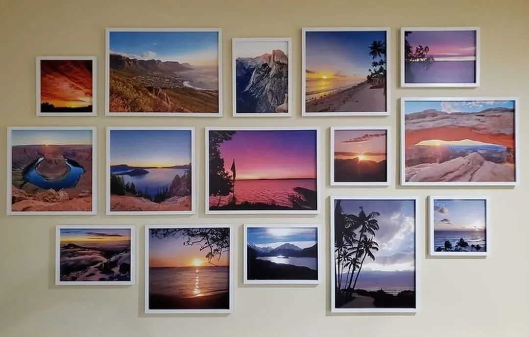
A 2×3, 3×3, or 4×3 grid creates a clean, architectural look that fits both modern and traditional interiors. Matching black frames or warm wood frames unify mixed artwork and photos. Grids work best above a buffet or centered over a large table because the straight lines echo the furniture silhouette.
Mirror-centered gallery, great with a chandelier

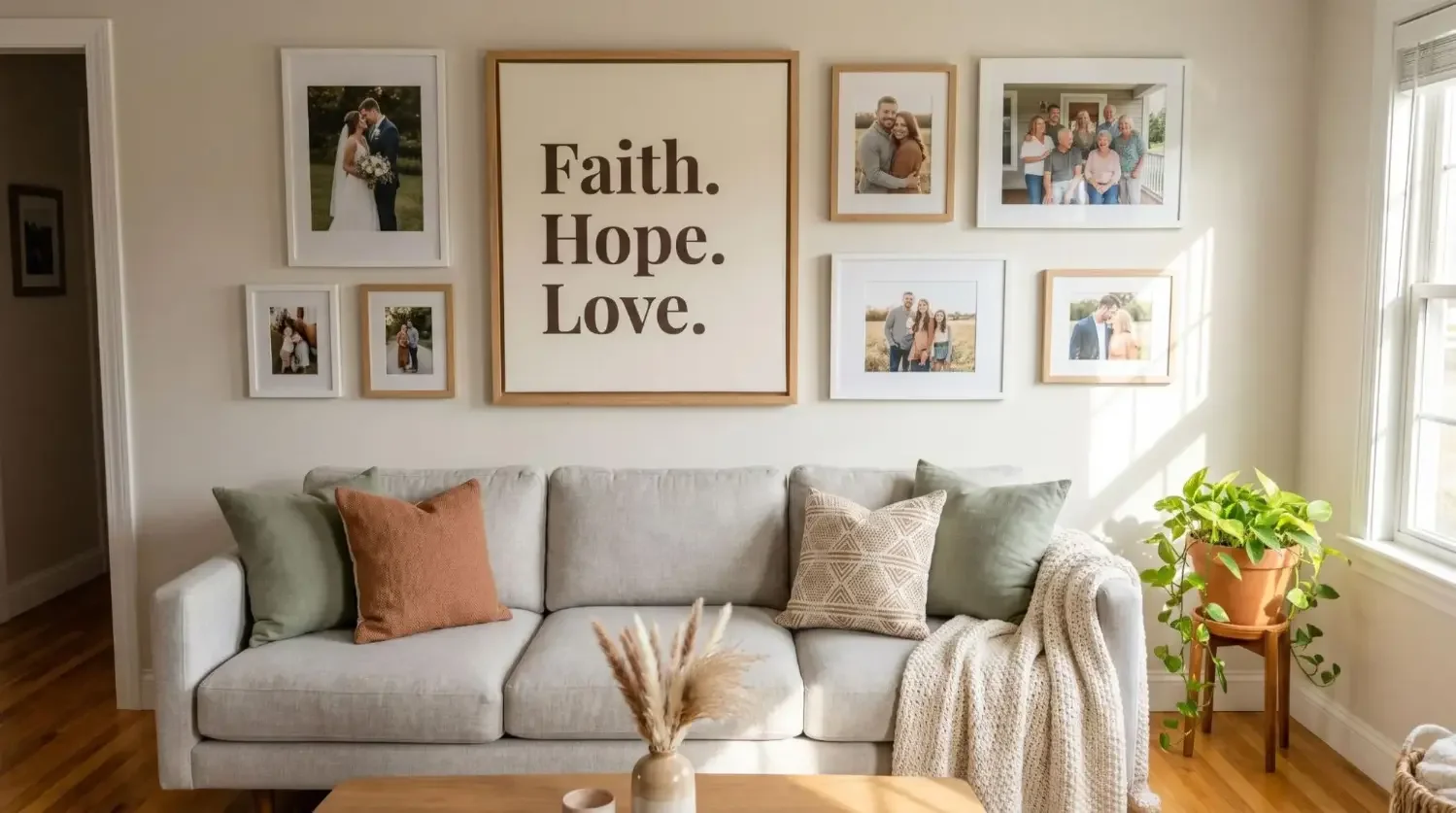
Place a vertically oriented mirror in the middle, then add two or four frames around it. The mirror reflects your chandelier and tablescape, which brings sparkle to evening dinners and adds depth to the room. This dining room decor idea is perfect when you want a focal point that also makes the room feel larger.
Organic cluster, casual and collected

Start with a favorite piece of art at the center, then work around it with frames of different sizes. Aim for visual balance rather than perfect symmetry. This layout is ideal if you want to mix family photos, travel pictures, and fine art prints without a rigid grid. Keep 2–3 inches of spacing so the cluster looks intentional.
Picture ledge hybrid, easy to rotate

Install one or two long ledges and layer frames. You can swap artwork for seasons or special occasions without rehanging. Keep heights consistent across the ledges and overlap lightly for a curated museum look in your home.
Corner or two-wall wrap, open-concept win

Continue the gallery around a corner to tie a dining area to a nearby living room. Maintain consistent frame finishes so the two walls read as one composition. This is a smart way to fill awkward wall space while connecting rooms in an open plan.
Plate-and-photo mix, dining-specific charm

Blend decorative plates with framed photos or illustrations of recipes and ingredients. The mix adds texture and a unique look, especially on white walls. Intermix plates as punctuation among the frames and keep spacing consistent so the composition feels cohesive.
Which photos and art look best in a dining room gallery wall?
Choose pieces that support the mood you want during meals. Pull colors from your rug, drapery, or chair upholstery so the art and furniture feel designed together.
Start with a color story
Pick one or two dominant tones to unify the gallery. Earthy palettes like terracotta, olive, and oat feel warm and grounded. If your artwork collection is diverse, print photos in black and white to make the overall design cohesive and calm.
Subject ideas that spark conversation
Mix family milestones, heirloom scans, and travel landscapes with a bold abstract or a vintage poster as your statement piece. Food illustrations and handwritten recipes add personal flair to a dining room gallery. The best galleries feel personal and curated rather than off-the-shelf.
Keep cohesion with frames and mats
Matching frames and consistent printed borders make different subjects look like a set. Or mix two finishes, for example black frames with one natural wood tone, so the gallery reads unified but layered. Mixtiles offers framed, frameless, wide frame, and canvas tiles so you can tailor the look to your interior design style.
Ready to bring your photos to life? Turn your favorite pictures into beautiful personalized canvas prints or other unique wall arts. Upload your photos to Mixtiles to see how they look before you order.
How do I plan and install a gallery wall without nails?
Plan the composition on a flat surface, decide spacing, then use Mixtiles’ peel-and-stick or magnet-backed options to hang cleanly. You can level and adjust as you go, which makes the process fast even in small spaces.
- Measure your wall area and define the maximum gallery boundaries so the composition fits your table and furniture proportions;
- Map your layout on the floor with frames of different sizes, then photograph the arrangement for reference;
- Lightly mark a centerline at 57–60 inches from the floor and note the bottom edge height if hanging over a buffet or banquette;
- Peel, stick, and press the first tile at the center, then work outward, keeping 2–3 inches between frames;
- Step back often to check balance and adjust; Mixtiles can be repositioned without tools or wall damage.
Measure, map, and mark lightly
Use painter’s tape to outline the gallery footprint on the wall so you see the final size. If you are building a room gallery wall that wraps a corner, extend the tape to the second wall so spacing stays consistent around the turn. A tape measure and a small level will help you keep rows aligned.
Spacing that always looks right
Most dining rooms look best with 2–3 inches between frames. Narrow spacing reads modern and intentional. Wider spacing can feel airy but use it carefully in smaller rooms where it might fragment the look. For grids, keep horizontal and vertical gaps consistent so the gallery feels precise.
Stick, level, and tweak with Mixtiles
Wipe the wall with a dry cloth before hanging. Place the first tile, then use its edges as your reference for the next. If you need to move a tile, lift gently toward the ceiling, realign, and press again. Clean tiles with a dry, soft cloth only. Mixtiles work on most painted walls and many textured surfaces, and they remove cleanly when it is time to refresh.
How do I coordinate my gallery wall with dining lighting and furniture?
Treat the gallery as part of your lighting plan and furniture layout. Align with the table and chandelier, avoid blocking sconces, and match metals for a pulled-together look that feels designed.
Work with your chandelier and sconces
Center the composition under the chandelier so everything feels aligned. If glare is a concern, choose matte prints or canvas tiles. A mirror-centered layout amplifies light in the evening and adds sparkle.
Scale with your table and chairs
Keep the gallery slightly narrower than the table for a grounded look. Leave enough clearance above seat backs. If chairs sit close to the wall, use low-profile frames and avoid placing a bottom row at bump height.
Tie in textures and metals
Echo finishes in the room. Black frames pair well with black hardware. Brass frames complement brass fixtures. Add one contrast, such as natural wood, to keep the composition dynamic without feeling busy.
What styles are trending for a gallery wall dining room in 2025?
- Timeless black and white grids with warm wood accents continue to be a favorite in dining rooms;
- Mirror-centered compositions flanked by smaller frames feel luxe and formal without being fussy;
- Earthy color palettes in linen-look printed borders create a calm backdrop for everyday meals;
- Edited maximalism is rising: fewer pieces, tighter spacing, bolder color stories, and one standout piece of art that anchors the gallery.
Can renters make a dining room gallery wall without damage?
Yes! Mixtiles are designed for stick-and-restick hanging, without nails or anchors. The adhesive is strong yet gentle, so tiles hold tight and remove cleanly. This is ideal for dining rooms in apartments where you want wall art now but also want flexibility later. Move frames when you rearrange furniture or repaint, and build your dining room gallery wall over time with new pictures and prints.
Mixtiles also offers gallery wall kits with templates and curated layouts if you want a ready-made design, canvas tiles for a soft matte finish with wrapped edges, and fine art prints that mix beautifully with family photos.
A great gallery wall dining room feels intentional: the right height, thoughtful spacing, and a layout that suits how you host and live. Choose a color story, decide whether a grid, mirror-centered set, or organic cluster fits your space, and skip the headache of nails with peel-and-stick frames. With Mixtiles, you can design, hang, and refine in minutes, then refresh whenever inspiration strikes and your home decor needs a little new energy.
Transform your dining room today and build beautiful photo walls with our no-nail frames.
Frequently Asked Questions
Are dining room gallery walls still in style for 2026?
Yes, dining room gallery walls are very much in style for 2026. Timeless grids, mirror-centered arrangements, earthy palettes, and edited maximalism (fewer pieces, tighter spacing) lead the trend. No‑nail options like Mixtiles keep the look flexible, so you can refresh art without damage.
What are the basic rules for a dining room gallery wall?
Center the composition at 57–60 inches from the floor, keep 2–3 inches between frames, and make the gallery slightly narrower than your table. Leave 6–8 inches above a buffet and 8–10 inches above a banquette. Balance visual weight and unify frames or finishes for cohesion.
How should I arrange wall art in a dining room?
Align the arrangement with your table and chandelier. Decide on a single statement piece or a gallery. Map the layout on the floor, anchor with a focal item, then balance pairs around it. Use painter’s tape to preview, then hang with peel‑and‑stick frames so adjustments are easy.
What layout works best for a dining room gallery wall?
It depends on mood and scale. Choose a grid for a polished look; a mirror-centered layout to reflect the chandelier and add depth; an organic cluster for a relaxed, collected feel; picture ledges for easy rotation; or a corner wrap to connect open‑plan spaces.
Be the first to know — deals, news & decor ideas.
By clicking you agree to the Terms of Use & Privacy Policy