
Photo Book Design Tips: Create Stunning Visual Stories
Key Takeaways
- Define a clear theme and sequence to tell a cohesive visual story that flows page to page;
- Use intentional layouts, typography, and color to amplify images, never compete with them;
- Edit and proof for print: resolution, color consistency, paper, and binding choices matter;
- Repurpose your best images beyond the book, turn them into movable wall art with Mixtiles.
Looking for photo book design tips that make your images shine in print? Whether you are compiling a travel photo book, a family yearbook, or a professional portfolio, strong design translates great photos into a compelling story. In this guide, you will learn how to choose a theme, curate and sequence like a pro, design balanced layouts with typography and color, prep files for flawless printing, and finalize your book. You will also see how to bring your favorite spreads to your walls with Mixtiles.
Ready to start your project? Create beautiful, high-quality photo books for any occasion, from a family photo book to a travel album, at mixtiles.com.
What theme will make your photo book unforgettable?
The right theme gives your book direction and helps every page support one story. Pick a purpose, define a narrative, then keep your selection tight so the final book feels intentional and memorable.
Build a tight concept
Choose a unifying thread like a location, time period, person, color palette, or mood. Draft a working title and subtitle to set expectations. This simple act guides curation, pacing, and design choices from the first page to the last.
Need inspiration to kickstart your concept? Browse these creative photo book ideas to spark themes, structures, and fresh approaches.
Scope and scale
Decide how many pages you want and stick to it. Plan loose sections or chapters early to avoid bloat. Good books feel focused, so resist the urge to include every image.
How do you curate and sequence images like a pro?
Great sequencing makes individual photos feel like a complete story. Start with a strong opener, vary image scale and subject, then land on a resonant closer that lingers.
The shortlist workflow
Use ratings or color labels to build a tight shortlist. Remove near duplicates. Prioritize a mix of wide, medium, and close details so each spread has rhythm and depth. If you are designing a wedding book, here is how to choose photos for a wedding album that will tell your story with clarity.
Narrative flow
Arrange by chronology, location, or mood. Use transitional photos that share color or subject to bridge sections. Open with a striking image, then maintain interest with contrast and pacing. Planning a trip story? Follow our step by step guide to make a travel photo book with seamless pacing and place-driven transitions.
Cohesion checks
Review spreads as a set. Keep white balance, contrast, and color grading consistent so pages look related, not random.
What makes a cover and title that people can’t ignore?
Your cover is the handshake of your book. Choose a hero image that captures the essence of your project and leaves room for clean, readable type.
- Hero image: Select one bold, on theme photo that hints at the narrative and looks good at small thumbnail sizes too.
- Title and subtitle: Keep it short, clear, and evocative. Test readability over the image and on the spine, then proof at actual size.
- Keep it uncluttered: Fewer elements read stronger. Make sure alignment and spacing feel intentional.
How should you approach layouts and white space?
Use layouts to highlight, not overwhelm. White space is your friend. It gives images room to breathe and makes each page feel premium.
Layout principles
Less is more. One to three images per page creates focus. Use a simple grid and consistent margins to unify the book. Establish a clear focal point per spread so the eye knows where to land.
Spread variety with intent
Mix full bleeds, single image pages, and small grids to create rhythm. Save double page panoramas for true showstoppers so the effect stays special.
Consistency
Repeat a small family of templates. Consistency reduces visual noise and speeds decisions so you can keep momentum.
Which typography and color choices actually help your images?
Type and color should guide the reader quietly. Aim for clarity and tone that support the photography, not a design showcase that competes with it.
Type pairing rules
Limit yourself to two or three fonts. Build hierarchy using size and weight, not novelty. A modern sans feels clean and minimal, while a serif adds editorial warmth. Always test legibility on light and dark areas.
Color strategy
Pull a small palette from recurring hues in your images. Use color sparingly for accents like section openers or captions. Prioritize contrast so text remains easy to read.
How do you write captions without stealing the spotlight?
Keep captions short and useful. Provide context that deepens the narrative without repeating what the image already says.
Be concise: Cover what, where, when, and why it matters in one or two lines. Place captions consistently under the image or in the margin. If your platform does not support page captions yet, like Mixtiles photo books currently, add a brief story on the title page or a closing page to anchor context.
Shortlist done? Bring your highlights to life on your walls. Create a movable gallery with our signature photo tiles. No nails, no mess, just peel, stick, and re-stick whenever you refresh the room.
What image edits ensure print-perfect pages?
Good edits unify the book and prevent print surprises. Calibrate, standardize, then refine so every page looks its best in print.
Technical checklist
Target 300 ppi at final print size for crisp detail. Calibrate your display and, if available, soft proof for print. Keep white balance and exposure consistent from page to page so readers see a cohesive set of images.
Creative polish
Make gentle global adjustments first, then local tweaks for contrast and color. Straighten horizons, crop with intent, and remove small distractions. Subtlety often prints better than heavy effects.
Which paper, size, and binding should you pick?
Format choices shape how your story feels in the hand. Match orientation and size to subject, then choose paper and binding that suit your images and budget.
Format decisions
Landscape works well for travel and vistas. Portrait flatters people and editorial sequences. Square is versatile and pairs well with Instagram era images and symmetrical design. If you are designing a statement piece for the living room, explore our guide to coffee table books to nail size, materials, and pacing.
|
Common Book Size |
Metric Size |
Best For |
|---|---|---|
|
8 × 8 inches |
20 × 20 cm |
Everyday photo books; compact gifts; one image per page. |
|
8 × 10 inches |
20 × 25 cm |
Family yearbooks; travel stories; mixed orientation images. |
|
11 × 14 inches |
28 × 36 cm |
Portfolios; landscapes; spreads with breathing room. |
|
12 × 12 inches |
30 × 30 cm |
Premium coffee table books; square Instagram sets. |
Paper and finish
Matte reduces glare and feels refined. Lustre adds subtle sheen and punchy color. Heavier stocks feel premium and help pages lie flatter. Choose what makes your images look their best under typical home lighting.
Binding
Layflat is ideal for panoramas and uninterrupted spreads. Standard binding is cost friendly and great for higher page counts.
Do you need a table of contents, page numbers, or an index?
Navigation elements are optional, but they can add polish. Use them when your book has chapters or documentary elements that benefit from quick reference.
Add a simple table of contents for multi section books. Use small, discreet page numbers that do not distract from images. Consider an index for places or people if you are building a documentary project or portfolio.
How do you proof, test, and finalize with confidence?
Slow down at the end. A careful proof prevents small errors from living forever in print, which saves time and money.
Preflight review
Check margins, bleeds, trim safety, and spine width. Verify caption placement, type sizes, and consistent styles. Make sure every image is the right size and resolution for the page.
Test prints
Order a single test copy to evaluate color, contrast, and readability in real light. Gather feedback from someone who has not seen the project, then refine sequence, density, and copy.
Branding touches
Add a small logo or mark on the title page or colophon. Keep it subtle so your art stays center stage.
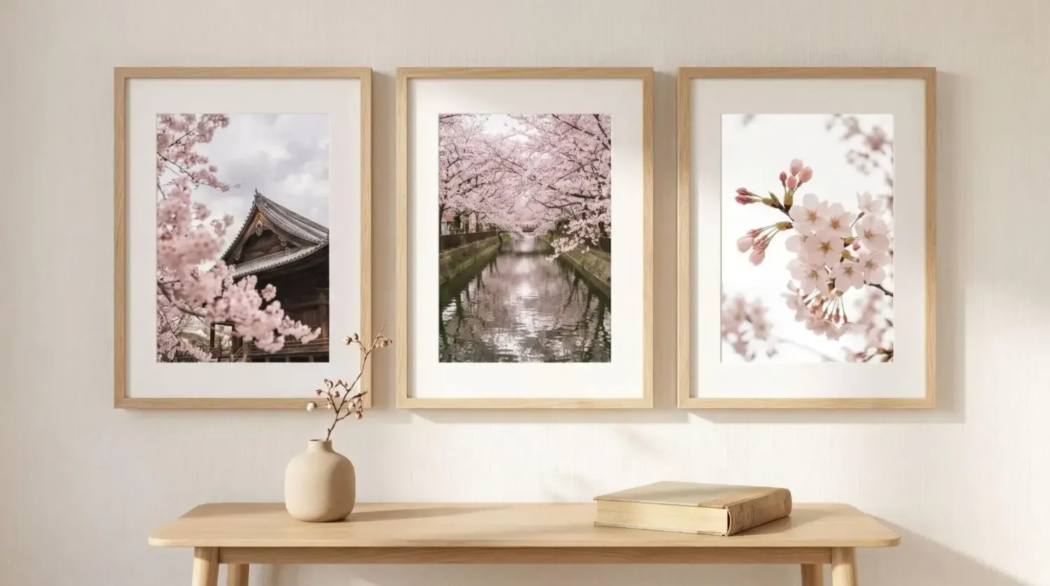
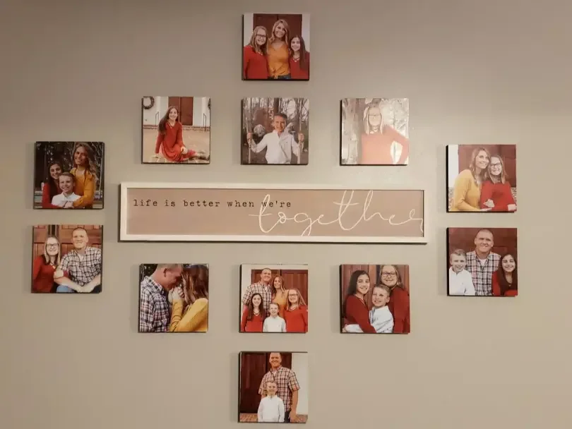
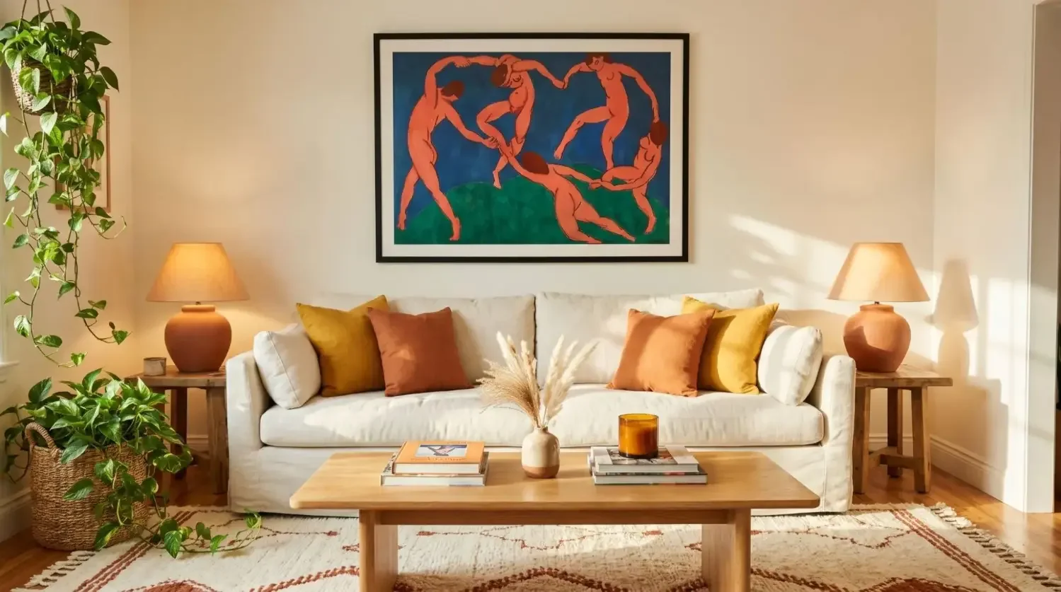
Bonus: How can your photo book live on your walls?

Turn standout images into wall art so you can see them every day. Pull the top six to twelve shots and recreate your book’s visual rhythm as a gallery wall. Mixtiles photo tiles are lightweight and damage free, so you can arrange, re arrange, and update as your next book comes to life.
Great photo books start with a focused story, thoughtful curation, and design choices that let your images lead. Clean layouts, disciplined typography, and restrained color help each page communicate well. Finish strong by proofing for print and choosing the right format and paper. When your book is done, extend its life beyond the page. Bring your favorite images into daily view as a flexible, re stickable gallery with Mixtiles. If you wanted the best photo book design tips in one place, now you can start making your book with confidence.
Turn your photo book’s standout shots into a stunning photo gallery wall you can rearrange anytime. Explore our collection of custom canvas prints to start your first set in minutes on the app or at mixtiles.com.
Frequently Asked Questions
What resolution and color settings do I need for sharp prints?
Export images at 300 ppi at their final print size. Use sRGB unless your printer specifies another profile, and embed it on export. Avoid heavy upscaling. If possible, soft proof to catch contrast or saturation shifts before ordering.
How many photos per page create a clean, premium look?
Limit most pages to one to three images. Use a simple grid and consistent margins to unify the book. Save full-bleed or double-page panoramas for true hero shots. White space adds focus, it makes books feel calmer and more refined.
How do I mix portrait and landscape images without awkward crops?
Respect native aspect ratios. Pair a large image with one or two smaller ones, or arrange a balanced grid. Crop with intention, never stretch. Keep alignments and margins consistent, and use white space to harmonize odd sizes rather than forcing edge-to-edge fills.
What is the best way to finalize before printing?
Run a preflight check for bleeds, trim safety, and spine width. Verify consistent fonts, caption placement, and minimum type sizes. Confirm image resolution on every page. Order a single proof, review in natural light, gather feedback, then refine sequence and color.
Be the first to know — deals, news & decor ideas.
By clicking you agree to the Terms of Use & Privacy Policy