
Photo Tiles Layout Ideas: Create Your Dream Gallery Wall
Key Takeaways
- Plan your layout around your wall size, furniture, and sightlines; grids, rows, and clusters all shine with simple spacing and consistent alignment;
- Start with proven patterns (2×3, 3×3, 4×3, stair-step, triptych) and customize with themes, color strategies, and a few playful asymmetrical arrangements;
- Use small-space heroes (vertical stacks, corner wraps, slim ribbons) to turn tight areas into striking focal points;
- Mixtiles’ adhesive, repositionable frames make testing layouts and refreshing photos easy. No nails, no damage: just peel, stick, and tweak.
Looking for photo tiles layout ideas that actually work in real homes? You are in the right place. This guide breaks down high-impact layouts, from timeless grids to creative clusters, so you can design a gallery wall you will love. Whether you are decorating above a sofa, up a stairway, or in a narrow hallway, you will get pro tips on spacing, alignment, and tile counts. Best of all, Mixtiles’ adhesive, repositionable frames make trying different looks simple and renter-friendly.
Start creating with our easy-to-hang photo tiles. Upload your pictures and design your wall in minutes.
How do you choose the right layout for your wall and furniture?
Match your arrangement to the wall and the furniture beneath it, then keep spacing consistent and center the display at eye level. A quick formula: align width to 60 to 75 percent of the furniture below, use 1 to 2 inches of spacing, and position the middle of the gallery at about 57 to 60 inches from the floor. For deeper guidance on proportions by room and furniture type, see our wall art size guide.
Start with proportions
Let your furniture define the footprint. Over a standard sofa or bed, aim for a layout that spans roughly two thirds of its width, centered horizontally. Over a narrow console or desk, scale down to a smaller grid or a single-row band that does not exceed the furniture width.
Set your spacing
Uniform gaps create calm, gallery-grade results. Keep 1 to 2 inches between tiles, about 2.5 to 5 cm. Mixtiles’ most popular square tiles are 8 by 8 inches advertised, with an actual face of about 8.4 inches; planning around that dimension makes calculations easy.
Eye-level rule of thumb
Place the center of your arrangement at about 57 to 60 inches from the floor. If art sits above a headboard or sofa, keep the lowest row 8 to 12 inches above the top of the furniture to avoid a cramped look.
Which classic grid layouts always look polished?
Classic grids deliver instant symmetry, scale beautifully, and are simple to expand later. Start with these four favorites, then add rows or columns as your photo collection grows.
2×3 Grid (6 tiles)

Compact and clean. This layout fits well above small consoles, desks, or in cozy nooks. Use it for a themed set like a weekend trip or a child’s milestones.
3×3 Grid (9 tiles)

The timeless square. Balanced from every angle and versatile enough for living rooms and dining areas. Works beautifully in black-and-white for a graphic, modern feel.
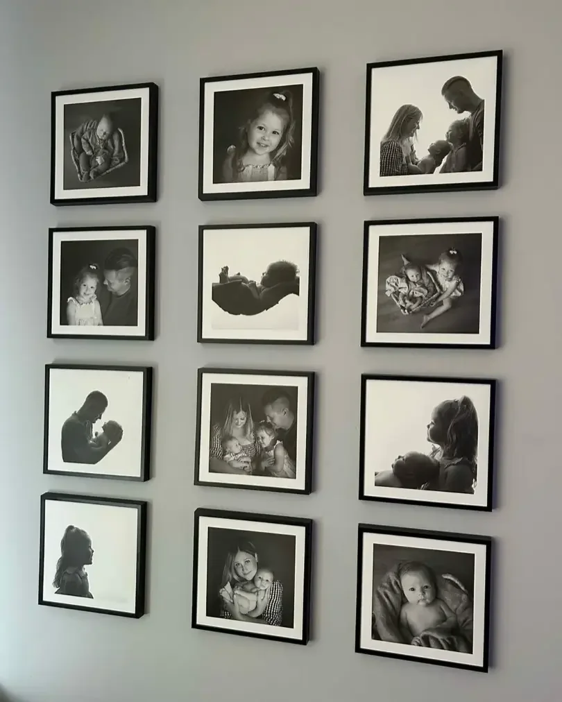
4×3 Grid (12 tiles)

Wide and impactful. Ideal above a sofa or long sideboard where you want a strong focal point. Keep gaps tight and edges aligned with a level for a crisp finish.
Tall 2×4 Grid (8 tiles)

Great for narrow walls or between windows. The vertical emphasis draws the eye up, which makes ceilings feel taller and rooms feel more open.
Want a modern, streamlined look above a sofa or bed?

Linear layouts create a tailored, calming presence that mirrors furniture lines. Try a single panoramic row, a double-row band, or a tile-based triptych for effortless sophistication.
Single Row “Panorama” (4 to 6 tiles)
Echo the width of your furniture with one sleek row. It is minimal, elegant, and perfect for landscape travel photos or a color-coordinated series.
Double Row Band (8 to 12 tiles)
Two straight rows form a refined band that feels built-in. Keep vertical spacing equal to your horizontal spacing for harmony across the wall.
Triptych with Tiles (3 to 6 tiles)
Group tiles into three sections. Let the center grouping feature your hero image, then flank with complementary shots for balance and rhythm.
How can you add movement with diagonals and diamonds?

Shift your grid on the diagonal to energize a wall. Diamonds and arrows introduce motion and guide the eye, which is perfect for modern rooms or long sightlines.
Diamond Grid (9 to 13 tiles)
Arrange tiles so the overall silhouette reads as a diamond. The result is dynamic yet orderly, especially when photos share a limited color palette.
Chevron or Arrow (5 to 9 tiles)
Create a subtle V or directional arrow with stepped tiles. Aim the point toward a fireplace, picture window, or favorite reading chair to invite attention.
Decorating a stairway or hallway, what layouts work best?

Follow the architecture. Mirror the stair angle with stepwise rows, or keep a narrow corridor tidy with a slender rail of tiles at eye level.
Stair-Step Grid (8 to 14 tiles)
Climb the wall in consistent steps that match the rise of the stairs. The repeating rhythm feels intentional and leads the eye upward.
Staggered Ribbon (6 to 12 tiles)
A single ascending line delivers a minimalist look that suits tight stairwells. Keep spacing tight and align the bottom edges to maintain flow.
Hallway Rail (6 to 10 tiles)
Hang one row at eye level down the hall. This keeps walking space clear while turning a pass-through into a personal gallery.
Want an eclectic, gallery-style vibe?

Choose relaxed symmetry. Organic clusters and offset stacks look collected over time, especially when you curate a theme or color family.
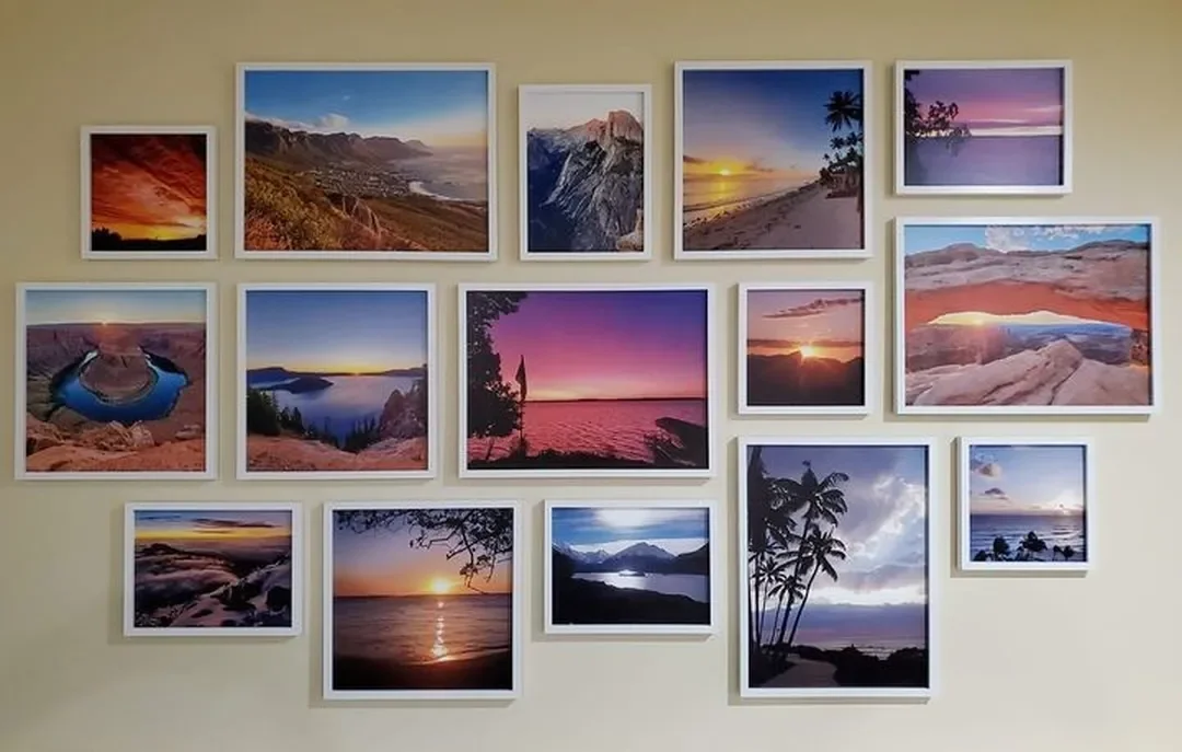
Organic Cluster (7 to 15 tiles)
Start with one tile at the center and build outward with even gaps. Mix portraits with landscapes, then rebalance by swapping tiles in seconds with Mixtiles.
Offset Stack (6 to 10 tiles)
Form two or three columns with tiles offset by half a tile. This gives visual rhythm without losing structure, great for home offices or dining rooms.
Ready to see your vision come to life? Preview your custom gallery wall digitally using the Mixtiles app or website to arrange and swap layouts before you order.
How do you make a small space feel big with photo tiles?

Use vertical emphasis and smart corners. A tall stack or a corner wrap adds height and dimension without crowding square footage.
Vertical Stack (3 to 5 tiles)
Place a slim column between windows or beside a bookcase. The upward pull elongates the room and creates a neat accent.
Corner Wrap (6 to 10 tiles)
Extend a layout across two adjoining walls. The wraparound effect feels custom and makes a small room feel more immersive.
Slim Column + Mini Row (5 to 7 tiles)
Combine a short horizontal row with a perpendicular column. This L-shape balances space and adds a designer touch to entries or alcoves.
Want playful shapes that double as conversation starters?

|
Room |
Recommended layout |
Typical tile count |
Ideal arrangement width |
Spacing |
|---|---|---|---|---|
|
Above a sofa |
Double row band |
8 to 12 |
60 to 75 percent of sofa width, about 48 to 72 in, 122 to 183 cm |
1 to 2 in, 2.5 to 5 cm |
|
Above a queen or king bed |
Single row or triptych |
6 to 9 |
50 to 70 percent of headboard width, about 36 to 66 in, 91 to 168 cm |
1 to 2 in, 2.5 to 5 cm |
|
Entry or console |
2×3 grid or single row |
6 to 9 |
Narrower than furniture, about 24 to 48 in, 61 to 122 cm |
1 to 2 in, 2.5 to 5 cm |
|
Stairway |
Stair-step grid |
10 to 16 |
Fill 60 to 80 percent of the run visually |
1 to 2 in, 2.5 to 5 cm |
Quick sizing tip: To estimate total width for a row, multiply the number of tiles by 8 inches, then add the number of gaps multiplied by 1 to 2 inches. Convert inches to centimeters by multiplying by 2.54.
What photo curation tips make your layout feel intentional?
Unify by color and story. Choose a consistent palette or filter, then balance close-ups with wide shots so the wall has a pleasing rhythm.
- Color strategy: Commit to color or black-and-white. If you mix, alternate to avoid heavy patches of one tone. Printed borders can create breathing room around bold images.
- Theme groupings: Build sets by trip, season, or milestone. A single theme per wall reads curated and makes future swaps straightforward.
- Visual rhythm: Alternate portrait orientation with landscape, and vary subject distance. Faces, details, and landscapes in rotation keep the eye moving.
How do you hang, align, and refresh your gallery with zero stress?
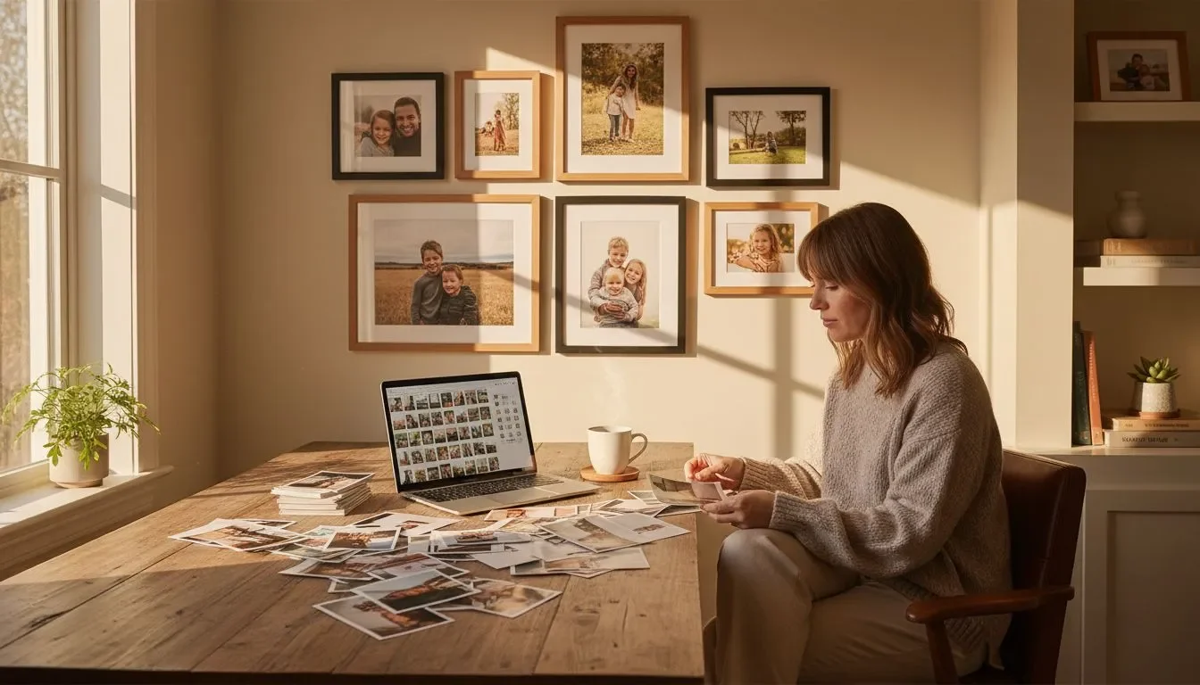
Plan on a table, preview with tape, then stick and adjust. Mixtiles mount cleanly on painted walls and many textured surfaces, so you can reposition without damage. If you want more tips on damage-free installs, learn how to hang wall art without nails from our step-by-step guide.
Plan with painter’s tape
Lay tiles on the floor to finalize order, then tape an outline on the wall to preview scale. Mark centers lightly with pencil to keep rows straight.
Mounting and alignment
Wipe the wall with a dry cloth. Peel and place your first tile at the center, then build outward. Press firmly for a few seconds, especially on lightly textured walls, to help the adhesive grip.
Refresh in minutes
Swap tiles seasonally or rotate new prints from your camera roll. If you want a statement finish, try Mixtiles Canvas Tiles or a curated Gallery Wall Set that arrives with a ready-to-hang layout template.
Care and compatibility
Clean with a dry, soft cloth. Avoid sprays and moisture. Mixtiles work best on flat, painted walls and often adhere well to brick, stucco, and wood paneling. For very rough surfaces, press longer and contact support if you need help.
Which rooms benefit most from photo tiles?
Any space that needs personality and flexibility. Photo tiles wall ideas shine in living rooms, bedrooms, kids’ spaces, and home offices because they are easy to update and gentle on walls.
- Living room: Anchor the room with a double row band or 4×3 grid. Pair with a Wall Sign or a small mirror to add depth.
- Bedroom: Keep it serene with a single row or a tile triptych above the headboard. Soft color palettes and printed borders feel calm and cohesive.
- Kids’ rooms and nurseries: Use low-height clusters so little ones can enjoy their art. As tastes change, reposition tiles or reprint with new photos.
- Home office: Choose neat grids or a 2×3 for focus. Mix in typography or a motivational Wall Sign to keep goals front and center.
The best photo tiles layout ideas balance structure and personality. Use classic grids and straight rows when you want a crisp, modern foundation; layer in diagonals, clusters, and playful shapes when you are ready to add movement and story. Plan around your furniture and sightlines, curate with color and theme, and keep spacing consistent. With Mixtiles’ adhesive, repositionable frames, you can iterate freely, no nails, no damage, until your gallery wall feels just right. For even more inspiration, explore Gallery Wall Kits, Canvas Tiles, and Photo Books to complete your space.
Ready to build your favorite layout? Explore our classic Mixtiles or try our beautiful canvas prints. For a compact and modern look, check out our popular 8x8 canvas photo prints.
Frequently Asked Questions
What is the best way to arrange photo tiles?
Start with a simple grid for a clean, modern look. If you want more movement, try staggered rows or a gentle organic cluster. Match the layout to your furniture width, keep spacing consistent, and place the center around eye level for balance.
Which photos look best on photo tiles?
Choose images with a strong subject, clear focus, and good contrast. Portraits, landscapes, and architectural shots print beautifully. For storytelling, mix family moments and travel highlights. Use a consistent color palette or filter so the wall feels cohesive.
How should I arrange my Mixtiles on the wall?
Plan on a table, then mark the outline with painter’s tape. Center the layout above your furniture, leave 1 to 2 inches between tiles, and place the middle at about 57 to 60 inches from the floor. Peel, stick, and reposition until everything aligns.
How do I display picture tiles without nails?
Use adhesive, repositionable tiles like Mixtiles. Wipe the wall, place your first tile at the center, then build outward with even gaps. Check alignment with a level or tape guides. If needed, lift and restick, the adhesive is designed for clean adjustments.
Be the first to know — deals, news & decor ideas.
By clicking you agree to the Terms of Use & Privacy Policy