
What Is Mid Century Modern Art? Transform Your Walls
Key Takeaways
- Mid century modern art blends clean lines, geometric and organic forms, and balanced color palettes born from post-war optimism and new materials;
- The style endures because it pairs minimalism with warmth, making it easy to integrate into today’s interiors and gallery walls;
- You can recreate an MCM vibe with prints, vintage posters, or even your own photos edited with era-inspired colors and shapes;
- Mixtiles makes it simple to build a mid-century-inspired gallery wall, stickable, repositionable frames with no nails or damage.
Wondering what is mid century modern art and why it keeps showing up in every interior design feed today? This timeless aesthetic from the mid twentieth century combines simplicity, function, and approachable warmth. Think clean lines, abstract shapes, organic curves, and earthy-meets-bright color stories. It is versatile, easy to mix with other styles, and perfect for building a gallery that feels both classic and fresh. On this page, you will learn the history, defining traits, palettes, and simple ways to bring the look home with Mixtiles.
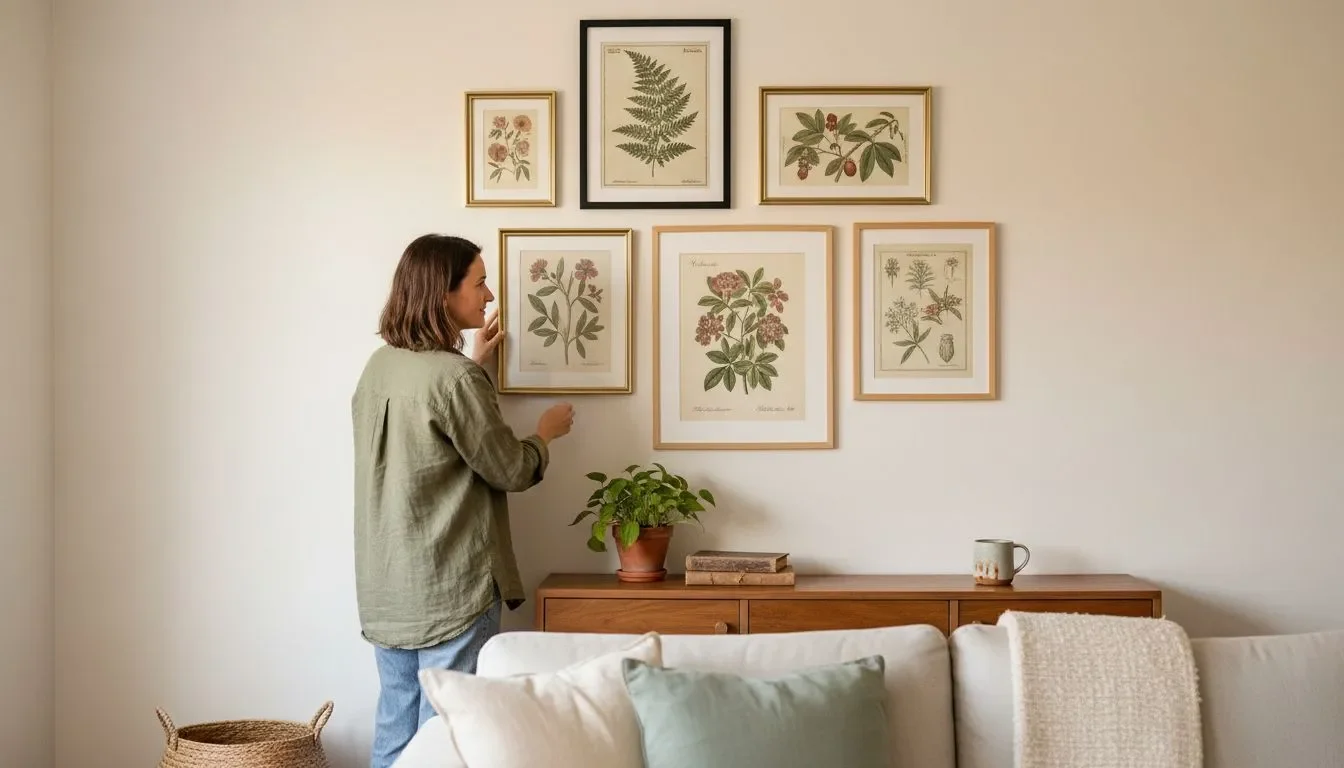
Create a mid-century-inspired gallery wall in minutes. Upload your photos in the Mixtiles app or on our website, choose a modern frame, and stick your custom photo tiles without nails.
So…what is mid century modern art, exactly?
Mid century modern art describes visual works created and popularized between the 1940s and 1960s. It sits alongside mid-century modern design in architecture and furniture, where function and beauty move together. You see a blend of abstract geometry and soft, natural forms, reduced ornamentation, and bold colors set against white or neutral backdrops. From fine art to modern wall art prints, the movement celebrates simple shapes, balanced composition, and a human, livable feel that still works in contemporary rooms today.
How did mid-century modern art emerge and evolve?
The style grew from a post-war period of optimism, new materials, and mass production. Influences range from Bauhaus and Scandinavian design to American modernism. Designers and artists explored new plastics, screen printing, woodblock, and collage, then brought that spirit into everyday life. Art moved out of formal salons and into living rooms, home offices, and entryways. The result: approachable pieces that felt at home with streamlined furniture, open architecture, and natural light.
What are the defining characteristics of mid-century modern art?
At its core, MCM art is minimalist yet warm. It uses clean lines, clear structure, and color that feels grounded in nature while welcoming bold accents. Below are the traits you will notice most.
Shapes and lines
Expect geometric forms like circles, triangles, and rectangles organized into calm grids or asymmetric balances. These are softened by organic, biomorphic curves inspired by landscape, plants, and the body. The contrast of strict geometry with gentle contours creates harmony. When you style your interior, echo these clean lines with streamlined furniture and let a few curved silhouettes, like a Saarinen-inspired pedestal table or a rounded lamp, soften the look.
Color palettes
Mid-century color is equal parts earthy and energetic. Olive, ochre, walnut, terracotta, and warm white meet teal, mustard, orange, blue, and red. Use bold colors sparingly so the room still feels minimalist and modern. A simple approach works best: pick one accent hue, then support it with two secondary colors and plenty of neutral space. If you love black and white, add a single pop of color for balance.
Materials and techniques
Artists embraced screen printing, collage, woodblock, and mixed media, plus innovations coming from furniture and architecture. You will see textures that feel handmade alongside crisp, printed edges. That mix is why mid-century modern art fits both refined and eclectic styles. It also translates beautifully into today’s prints and photo tiles without losing the original spirit.
Which artists and designers shaped the mid-century modern look?
There is no single author of the movement. Painters, graphic artists, architects, and product designers shaped a shared language that still guides art and design today.
Art and color fields
Abstract expressionists and color-field painters taught us to feel color and shape without literal subjects. Their simplified compositions, soft edges, and large fields of tone influenced the calm, immersive quality of mid-century works. This is why a large abstract can anchor a living room art arrangement so effectively.
Design pioneers
Figures like Charles and Ray Eames, Eero Saarinen, and Alexander Girard blurred lines between art and design. Their furniture and textiles expressed the same principles you see on canvas: simplicity and playful geometry. When you coordinate art with furniture, you mirror the original mid-century modern design intent.
Graphic heritage
Vintage posters, typography, travel ads, and atomic-age motifs brought the style to the public. These prints remain popular because they feel fresh, affordable, and easy to pair. They make great starting points for a new collection, especially if you want a quick way to introduce color and movement to a space.
How do you choose mid-century modern wall art for your space?
Begin with your room’s palette and furniture width, then decide between one large focal piece or a tidy grid. Frames matter too. Aim for simple profiles that let the art and design language shine.
Start with your palette
Pull colors from existing decor, like your rug, sofa, or bedding. If your room is mostly white or neutral, choose one accent like teal, orange, or rust, then add two quieter supporting hues. For an eclectic interior, repeat one color across three or more pieces so the gallery feels intentional, not random.
Size and scale made simple
Use the quick table below to find the right art width relative to furniture. This keeps proportions balanced in any room or hallway.
|
Furniture Type |
Typical Width |
Recommended Art Width |
Good Mixtiles Configurations |
|---|---|---|---|
|
Sofa, 3-seat |
84 in, 213 cm |
56 to 72 in, 142 to 183 cm |
3 × 20×27 in, 51×69 cm; 2 × 27×36 in, 69×91 cm. |
|
Queen bed |
60 in, 152 cm |
40 to 48 in, 102 to 122 cm |
3 × 12×16 in, 32×41.8 cm; 4 × 12×12 in, 31.6×31.6 cm. |
|
Console or credenza |
48 in, 122 cm |
32 to 40 in, 81 to 102 cm |
2 × 12×16 in, 32×41.8 cm; 6 × 8×8 in grid, 21.35×21.35 cm each. |
|
Desk or home office |
55 in, 140 cm |
36 to 44 in, 91 to 112 cm |
3 × 8×11 in, 21.35×27.94 cm; 1 × 20×20 in, 49.53×49.53 cm. |
For more room-by-room measurements and visuals, check our wall art size guide.
Frames and finishes that feel MCM
Pick simple frames in black, white, or a natural wood look. A printed border can create that classic mat effect without the bulk. Mixtiles offers framed, frameless, wide frame, and custom canvas prints options, so you can keep the look clean and consistent across different rooms while staying within budget.
Quick checklist
- Keep shapes simple;
- Limit colors for cohesion;
- Repeat one accent color across multiple pieces.
What layout ideas give you that authentic MCM vibe?
Mid-century layout principles favor balance and clarity. Choose symmetry for calm or a measured asymmetry for movement. Keep spacing even so the collection reads as one design. For step-by-step planning, see our guide on how to arrange art on a wall.
The tidy grid

Perfect for minimalist interiors and narrow walls. Try a 4, 6, or 9-tile grid that lines up to a clear center. Geometric abstracts, minimalist line drawings, or simple landscapes look especially strong here.
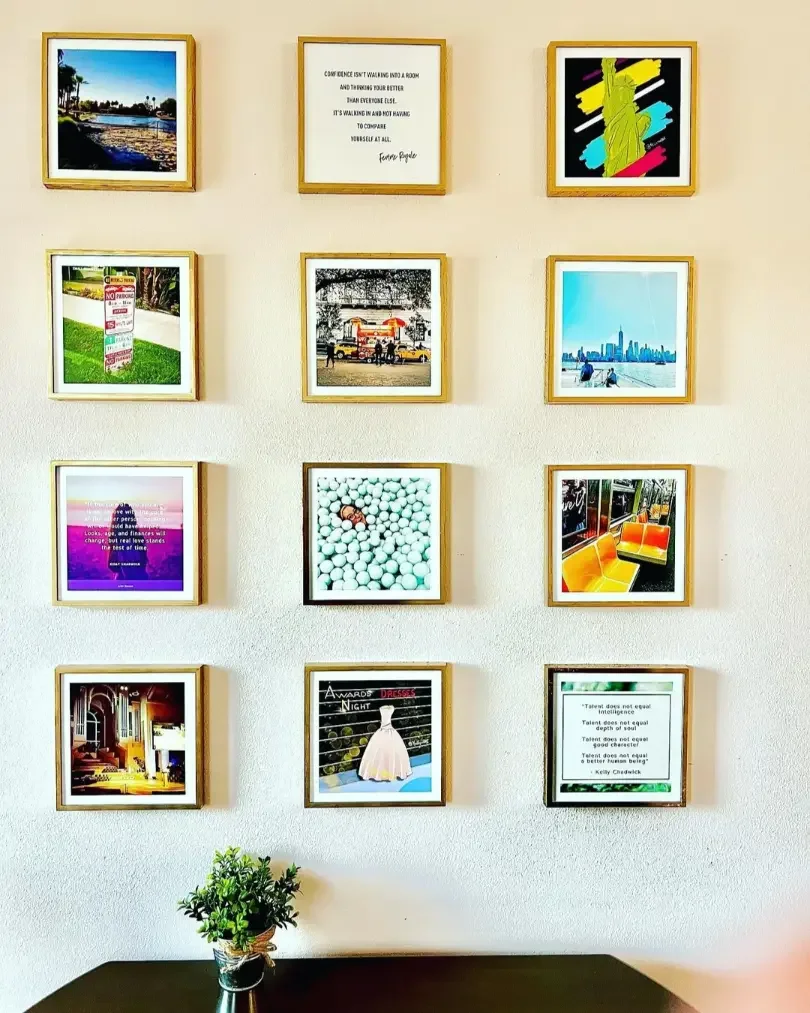
The balanced gallery wall

Mix sizes, but align around a baseline or centerline. Combine abstract prints with a vintage travel poster or two, then add a black and white photo for contrast. This is a great way to showcase new arrivals without rebuilding the whole wall.
The offset stack

Ideal for entryways and small spaces. Stack two or three pieces with slight horizontal offsets. It adds vertical energy without feeling busy, which is helpful near doors and hallways.
Spacing rules of thumb
- Keep 2 to 3 inches, 5 to 8 cm, between frames;
- Hang centers around 57 inches, 145 cm, from the floor for eye-level harmony;
- Aim for art that is about two-thirds the width of nearby furniture.
For exact eye-level measurements and exceptions, explore how high to hang art on a wall.
Preview your MCM gallery wall before you order. Upload your favorite photos to create beautiful canvas prints, including popular 20x20 canvas prints. Test layouts and swap frames instantly in the Mixtiles app, then stick, swap, and move your art without nails.
Can your own photos feel mid-century modern?
Yes. With a few edits and smart subject choices, personal photos can become modern wall art that fits mid-century modern style perfectly.
Edit with era-inspired color
Reduce saturation slightly, lift contrast, and lean into olive, mustard, teal, rust, and warm white. For a bolder look, introduce red or orange as a single accent. These bold colors echo the period without overwhelming your space.
Look for geometry in the everyday
Seek out architectural lines, window grids, stair rails, and strong shadows. In cities like Los Angeles, mid-century architecture offers endless subjects. Even a simple facade can become striking contemporary art when you crop to highlight shapes.
Add soft, organic forms
Balance geometry with plants, ceramics, textiles, or silhouettes. Portraits of people and even an AI pet portrait can feel midcentury modern when framed by clean shapes and neutral backdrops.
Pro tip: Convert a small set to black and white to calm a colorful room, then anchor the gallery with one large abstract in your chosen accent color.
What are the most common mistakes to avoid?
Most issues come from crowding, inconsistent palettes, and scale mismatches. Solve those first and your gallery will feel refined.
Overcrowding the wall
Give each piece breathing room. If your living room wall feels busy, remove one or two tiles and tighten color repetition. Clean space is part of the style.
Mixing too many palettes
Stick to one dominant palette per room. For example, blue with walnut and cream is cohesive; blue with green and bright red can feel chaotic unless carefully balanced.
Oversized art on undersized furniture
When a console or headboard is narrow, pick smaller works or a tidy grid. Use the sizing table above to guide proportions before you shop or print.
How can you blend mid-century modern with other styles you love?
Blend by matching attitude and color rather than forcing perfect era matches. Keep forms simple, repeat colors, and let textures do the rest.
Scandinavian quiet luxury

Pair MCM geometry with light woods, soft textiles, and a minimalist palette. The result feels modern, calm, and natural, which is perfect for a home office or bedroom.
Contemporary minimalism

Use large, simple abstracts with crisp frames. Choose black, white, and one accent to keep the design clear. This pairing highlights clean lines and makes rooms feel larger.
Boho warmth

Layer earthy tones and woven textures with a few mid-century shapes. Terracotta, rust, and olive unite eclectic decor while keeping the overall look simple and grounded.
Mid-century modern art endures because it is simple, warm, and adaptable. Whether you love abstract geometry, vintage-inspired posters, or your own photos tuned to era-friendly colors, this movement makes rooms feel curated yet welcoming. Keep palettes tight, shapes clear, and layouts balanced. With Mixtiles, you can experiment freely, build a gallery that fits your space and style, and refresh it anytime without damage.
Ready to bring mid-century modern to your walls? Start creating your custom wall arts on our website. Upload your images, choose your frames, and build the perfect photo gallery wall. No nails, no damage, all style.
Frequently Asked Questions
What defines mid century modern art?
Mid century modern art centers on simplicity and function. Expect clean lines, clear geometry, and soft organic curves, minimal ornament, and balanced compositions. Palettes blend earthy neutrals with bold accents. Techniques like screen printing and collage are common. The result feels approachable, modern, and timeless at home.
What does mid century modern art look like on the wall?
On the wall it reads as calm and intentional. Geometric abstracts or nature-inspired forms, plenty of negative space, and a tight palette. Simple black, white, or wood-look frames keep focus on shape and color. Grids and balanced galleries shine, and stickable Mixtiles make spacing and rearranging effortless.
How would you describe mid century modern style overall?
It is a 1940s to 1960s design approach that unites form and function. Streamlined furniture, organic shapes, honest materials, and light-filled spaces create comfort without clutter. The style is minimal yet warm, making it easy to mix with Scandinavian, contemporary, or boho interiors.
What are the core elements of mid century modern decor?
Core elements include simple elegance, organic motifs, and clear geometric shapes. Rooms favor multi-functional layouts, low profiles, and natural woods. Art acts as a refined accent, palettes are restrained, and indoor plants or textures add warmth. The overall effect is ordered, inviting, and easy to live with.
Which colors work best for mid century modern art?
Start with grounded tones like walnut, camel, warm white, olive, and terracotta. Add a single accent such as teal, mustard, orange, red, or cobalt, then support it with two quieter hues. Leave generous negative space. Black and white compositions also work, especially with one strategic color pop.
Be the first to know — deals, news & decor ideas.
By clicking you agree to the Terms of Use & Privacy Policy