Big Wall Decor Ideas: Transform Your Space with Style
Key Takeaways
- Understand scale quickly with simple sizing rules, then pick layouts that flatter your furniture and room proportions.
- Explore 35 big wall decor ideas, from calm grids and triptychs to salon walls, ledges, and renter-friendly murals.
- Follow ready-to-use layout recipes with measurements in inches and centimeters, so your designs look polished the first time.
- Build and refresh galleries in minutes with Mixtiles adhesive, repositionable photo tiles, canvas prints, and gallery wall kits.
Big walls are exciting, and a little intimidating. The right large-scale decor can anchor your room, add personality, and make home feel finished. Whether you love crisp grids, oversized statement art, or cozy gallery mixes, this guide shows you how big to go, how to plan your layout, and which ideas fit each room. Most options are renter friendly, lightweight, and easy to swap seasonally, especially with adhesive, repositionable wall photo tiles from Mixtiles.
Design your big wall in minutes. Upload your photos to create custom photo tiles that stick and restick with no nails. Or, turn your favorite moments into beautiful canvas prints. Visit mixtiles.com to start.
What counts as “big wall decor,” and how big should you go?
Big wall decor spans oversized single pieces and multi-panel displays that command attention from across the room. A reliable target is to fill about two thirds of the width of the furniture below, and to keep the visual center near eye level. If you are choosing between one large piece and several 8x8 canvas prints, match the layout to your room’s vibe: single statements feel minimal and modern, multi-piece layouts feel dynamic and personal.
The 2/3 rule for sofas, beds, and consoles
To look balanced, your art or arrangement should measure roughly two thirds the width of the anchoring furniture. If your sofa is 84 inches wide, plan for a layout around 56 inches wide. For a queen bed that is 60 inches wide, a 40 inch wide arrangement feels right. The 2/3 rule works with single canvases and with grids of Mixtiles. It keeps proportion consistent so the wall never looks too empty or too busy.
For a deeper walk-through by furniture type, see our guide on how big should art be on a wall, with room-by-room examples and quick charts.
Ideal spacing: margins, gaps, and eye-level height
Leave a comfortable margin above furniture. Aim for 6 to 10 inches above a sofa or headboard. Keep the center of the composition near 57 to 60 inches from the floor, which aligns with typical eye level. Between tiles, use a consistent gap. Two inches, or about 5 centimeters, reads clean and gallery-like for medium tiles. Narrow to 1.5 inches, about 4 centimeters, when working with 8 inch tiles or tighter walls.
Single statement vs. multi-piece layouts, how to choose
Choose a single statement piece when you want a calm focal point, minimal styling, and fast installation. Choose multi-piece layouts when you want to tell a story, mix photos with art, or flexibly scale up to fill wide walls. Mixtiles makes both paths easy, since tiles are light and movable. You can start with a triptych, then expand into a 4 by 3 grid later with matching frames.
Quick math example for sizing over a sofa
Say you have a 90 inch sofa. Two thirds of that is about 60 inches. A 5-piece panorama with five 12.44 inch wide tiles and four 1.5 inch gaps totals about 68.2 inches. That is a bold but still balanced fit. Prefer a calmer look. A 3 by 3 grid with 12.44 inch tiles and 2 inch gaps totals about 41.3 inches square, which suits smaller walls or shorter sofas.
When to go oversized vs. medium-but-many
Go oversized if you have tall ceilings, minimal decor, or a strong architectural anchor like a fireplace. Go medium-but-many when you want flexibility, seasonal swaps, or when doors, vents, and switches complicate the wall. Medium tiles let you route around obstacles while keeping a cohesive field.
How do you plan a large wall layout without guesswork?
Measure the wall and the furniture that anchors it, choose a focal center, then mock up your ideal layout before you start sticking anything. Painter’s tape, paper templates, and the Mixtiles preview tool make it simple. Keep your gaps consistent, pick a clear color palette, and check balance from a few steps back before you commit.
Measure once, mock up fast (painter’s tape, paper, app previews)
A quick plan saves time and avoids rework. Use this sequence to move from idea to clean install.
- Measure the available width and height, plus the furniture below for reference;
- Tape a rough bounding box at the target size using painter’s tape, then mark the composition center at eye level;
- Cut paper rectangles to tile size, tape them inside the box, and test different gaps until it feels right;
- Open the Mixtiles app to preview grids and triptychs on your actual wall, then match the spacing you liked with tape;
- Commit to the layout, wipe the wall with a dry cloth, and start mounting from the center outward for perfect symmetry.
Pick a focal center: TV, fireplace, headboard, or architectural feature
Center the composition on what people look at most. Around a TV, mirror its rectangle with a frame of tiles for symmetry. Over a headboard, keep the layout low and wide so it feels calm. If you have a fireplace or windows, align to those features rather than the total wall width.
Balance weight: color blocks, frame tones, and visual anchors
Dark frames and saturated images feel heavier. Distribute them evenly, then place a visually strong image near the center to anchor the composition. If you are mixing personal photos and art, alternate them to avoid clustering similar colors in one corner.
Sample gap sizes that feel gallery-level polished
Try 1.5 inches, about 4 centimeters, for 8 inch tiles. Try 2 inches, about 5 centimeters, for 12 inch tiles. Go to 2.5 inches, about 6 centimeters, if you have very large canvases over 24 inches. Consistency matters more than the exact number.
Three foolproof palette strategies (monochrome, analogous, high contrast)
Monochrome unifies mixed subjects and looks modern. Analogous colors, like blues and greens, feel calm and cohesive. High contrast palettes with a repeating accent, like rust or coral, create energy that suits living rooms and creative spaces.
Which big wall decor ideas work in most rooms?
The most versatile ideas for large wall decor are simple to align and easy to scale. Start with symmetrical grids, triptychs, and picture ledges. Add oversized single pieces or opt for a wall of mirrors when you want light and a bigger feel. Blend personal photos and abstract art to keep focus without clutter.
Symmetrical grids (3x2, 4x3, 4x4) for a modern, calm look
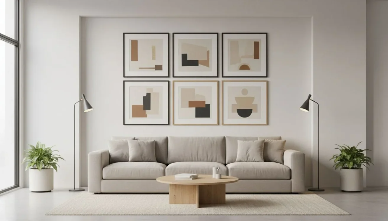
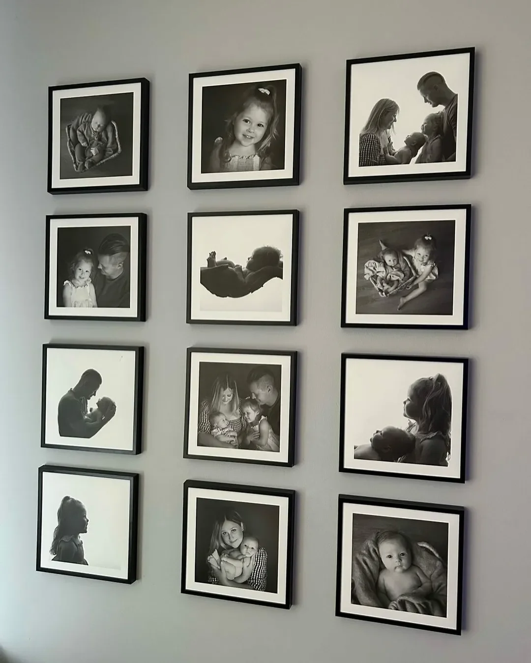
Grids read as tidy and architectural. A 3 by 2 is 6 squares which can cover a compact space. A 3 by 3 is nine strong squares that work almost anywhere, from over a sofa to an entry focal wall. A 4 by 3 spans wider walls without getting too tall. A 4 by 4 fills large wall spaces gracefully in dining rooms and media rooms.
Triptychs and 3-piece panoramas for landscape photos and art

Divide a wide photo across three or five horizontal tiles to add motion without losing simplicity. Triptychs are great above consoles and beds. Five-piece sets make a dramatic anchor in open-plan spaces.
Salon gallery walls mixing sizes, edit like a pro
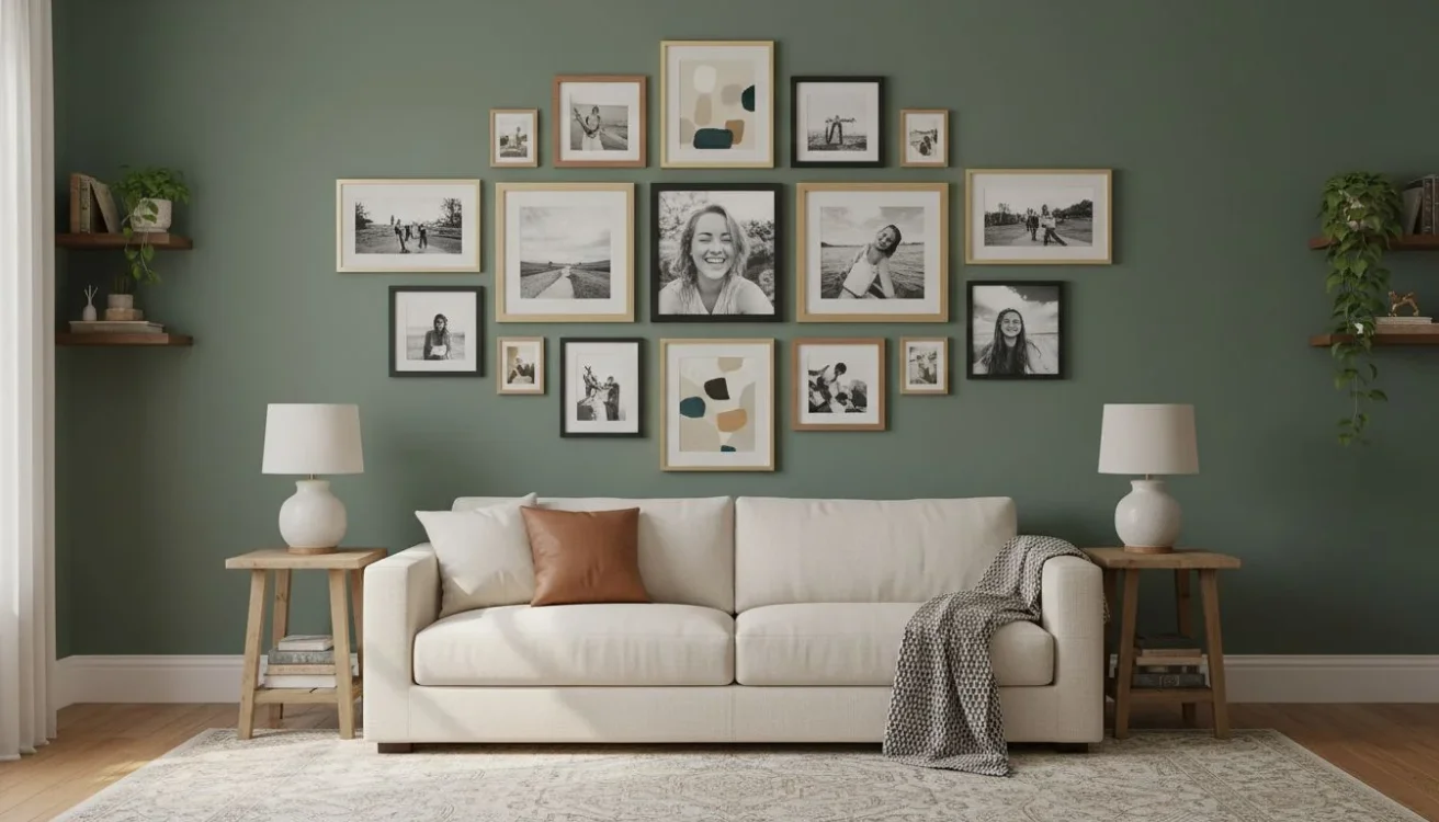
A salon gallery wall lets you mix squares and rectangles around a central axis. Keep outer edges roughly rectangular so the whole picture wall looks intentional. Repeat frame colors for cohesion, and space tightly to feel collected and cozy rather than scattered.
Picture ledges for flexible, layered displays

Ledges let you layer frames, books, and small objects. Stagger two ledges with a consistent offset. Swap art and photos seasonally without touching the wall. Pair with Mixtiles above or beside the ledges for extra scale.
Oversized single statement art for instant impact
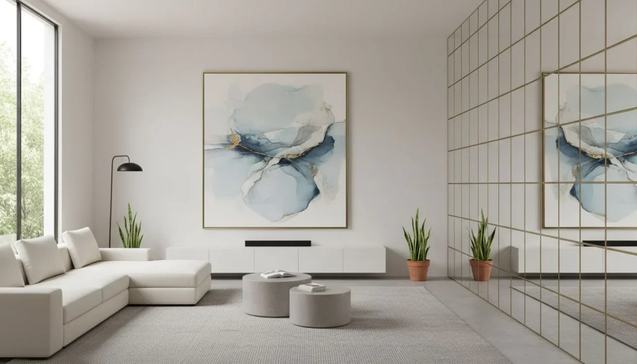
One large piece, like our 27 by 36 inch personalized canvas prints, calms a busy room. Choose abstract color fields or large-scale nature for a restful mood. This approach suits minimal and modern interiors that value negative space.
Pro tip: Blend personal photos with abstract art to avoid visual clutter. Alternate a family portrait, an abstract color study, a landscape, then repeat. The rhythm lets eyes rest. You can source fine art prints directly in Mixtiles to mix with your photos for a curated finish.
What are the best big wall decor ideas for living rooms?
Anchor the main seating wall with a layout that is wider than it is tall. Frame the TV with tiles or choose a balanced grid over the sofa. Keep edges aligned with furniture. Repeat two or three frame tones across the room to tie everything together.
Above the sofa: 3x3 grid vs. long triptych
A 3 by 3 grid using 8 to 12 inch picture tiles creates a broad rectangle that complements long sofas. For a lighter look, try a long triptych with taller rectangles spaced 1.5 inches apart. Both keep sightlines open in living areas.
Around the TV: frame it with a balanced gallery
Create a rectangular halo of tiles around the screen. Keep gaps even with the TV margins so the frame reads as one integrated piece. Start with a 3 by 2 on each side and one row above. Expand as needed.
Over a console: long row or stacked double row
A single row of five to seven tiles maintains a low profile for narrow walls. On taller walls, a double row with equal gaps looks custom. Place consoles at least a few inches below the lower edge to avoid crowding.
Architectural walls, fireplace or niches: keep it clean and symmetrical
Let the architecture lead. A centered 3 by 3 above a fireplace feels classic. In a niche, use one size consistently and follow the niche’s edges for a built-in look.
Example layouts with counts and spacing for common wall widths
For a 9 foot wall, a 4 by 3 of 8.4 inch tiles with 1.5 inch gaps is about 38 by 28 inches, which leaves breathing room. For an 11 foot wall, a 4 by 4 of the same tiles at 1.5 inch gaps is about 38 inches square and pairs well with tall curtains and floor lamps.
And if you’re looking for other ideas to spruce up your space, consult our guide to living room wall decor.
How can you fill a big bedroom wall without overwhelming the space?
Keep bedroom layouts calm, lower, and slightly wider than tall. Use softer palettes, lighter frames, and a tighter vertical footprint above the headboard. On the wall opposite the bed, choose one large piece or a perfectly level grid.
Above the headboard: low-profile grid or gentle asymmetry
A 3 by 2 grid hung 6 to 8 inches above the headboard looks tailored. Prefer a relaxed feel. Try a gentle asymmetry with one larger canvas paired with two smaller tiles offset to one side.
Opposite the bed: calming, large-scale art
Choose a single large canvas or a wide triptych with soft tones. Landscapes, abstract washes, and black-and-white photos slow the eye and support rest.
Narrow walls: vertical stacks and staggered duos
Stack three squares vertically with 1.5 inch gaps to elongate a tight wall. Or use a staggered duo of rectangles to add motion without clutter.
Soft palettes and materials for restful vibes
Consider warm wood frames, linen textures, and pale color stories. A printed border on Mixtiles can create a mat-like effect that feels airy.
Look to add some style to your living quarters? Read through our bedroom wall decor ideas to lift your inner decorative spirit.
What big wall decor ideas make entryways and hallways feel intentional?
Entryways and halls benefit from confident focal points and repeated rhythm. Use a bold grid at the entry, then carry a linear sequence down the hall. Add a mirror near the door for light and quick checks.
Entry focal wall: 3x3 grid with a mirror or sconce pairing
Place a 3 by 3 grid as a welcome moment. Balance a round mirror or a pair of sconces beside it. Keep the lowest row high enough to clear console decor.
Long hallway: linear sequences and story-driven galleries
Run a row of equally spaced tiles at 57 inches to center. Alternate travel photos, family milestones, and fine art prints for a story that unfolds as you walk.
Nooks and drop zones: mini grids and ledges
In tight niches, a 2 by 2 mini grid or a short ledge is enough. Keep it clean to avoid visual clutter where bags and coats land.
Wayfinding with color: using repetition to guide the eye
Repeat one accent color, like navy or terracotta, every few tiles. The repetition pulls you through the space and ties rooms together.
How do you style a large staircase wall without making it chaotic?
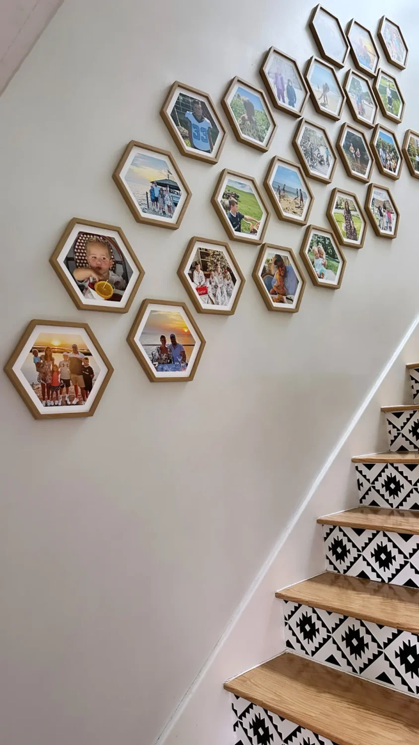
Follow the rise of the stairs with a diagonal flow. Use consistent frames and tight gaps. Start at an anchor point and grow the composition up and out. Keep safety in mind by leaving clearance over steps and landings.
Diagonal flow galleries that climb with the stairs
Build a loose 45 degree line from the first landing. Keep the lower edge 6 to 8 inches above the handrail for clean breathing room.
Repeating frames, varied imagery for cohesion
Choose one frame style, like black thin frames, for the whole staircase. Vary subjects to add interest without noise. The frame repetition does the unifying work.
Anchor points: where to start and end the cascade
Start with your strongest photo at the first landing where people pause. End near the upper landing with a calm image so the eye settles.
Safe spacing on steps and landings
Leave extra clearance above steps so nothing is within reach when walking. Keep gaps small so edges do not appear misaligned from different viewing angles.
Curious to see how Mixtiles’ can be incorporated into your home decor? We cover real-life examples of staircase wall decor that will inspire you.
Ready to see your ideas on the wall? Use the Mixtiles preview to design your perfect photo gallery wall, then order adhesive frames that move when your style does.
What renter-friendly big wall decor options actually look high-end?
Adhesive, repositionable formats deliver the custom look without tools or wall damage. Combine photo tiles with peel-and-stick murals, lightweight textiles, and leaning art for layered depth that feels designer and still removable.
Adhesive, repositionable photo frames, no nails, no damage
Mixtiles photo tiles and gallery wall kits stick and restick on flat painted walls, many textured walls, wood paneling, and even some wallpapers. They are light, glass-free, and cleanly removable, which makes large compositions easy in rentals.
Peel-and-stick murals as a backdrop for framed art
A subtle mural adds scale behind a simple grid. Choose quiet textures like linen or plaster. Then float a 3 by 3 or 4 by 3 set on top for a designer finish.
Lightweight statement pieces: tapestries, fabric panels
Tapestries add softness and scale. Pair a large fabric field with two vertical tile stacks on one side for balance and variety.
Leaning art on mantels and consoles for layered depth
Lean a large canvas and layer two or three smaller tiles in front. The overlap adds depth without holes. Add a wall sign from Mixtiles for an easy caption or family name.
Create a “built-in” feel with consistent borders and repetition
Use printed borders on tiles to mimic matted frames. Repeat the same border depth across the wall, and your gallery will read as custom millwork.
How can you create a big look on a budget?
Scale is not about spending on one giant piece. Many medium tiles produce the same presence for less. Mix personal photos with free art sources. Reuse frames and rotate content by season to keep the wall fresh without constant new purchases.
The “go medium but many” strategy
Nine to sixteen 8 inch tiles create presence equal to a single oversized piece, with more flexibility and often a lower total cost. Expand over time as your gallery grows.
Mix personal photos with free or public-domain art
Combine family shots with museum open collections and Mixtiles’ licensed art. The mix looks curated and stretches your budget.
Reuse frames; refresh the content seasonally
Order a few extra prints or alternate tiles. Swap in autumn color stories, winter black-and-white, and spring botanicals. Store unused tiles with wax paper covering the adhesive to keep dust off.
Batch ordering and cohesive framing for premium impact
Order sets with the same frame style and printed border depth. Consistency creates a high-end look, even when the images vary widely.
Cost-effective counts: where 9–16 tiles beat one giant piece
In living rooms, a 4 by 3 grid of 8 inch tiles often costs less than a single 44 inch wide canvas, while covering a similar footprint. The grid is also easier to carry, hang, and move later.
What big wall decor ideas fit different interior styles?
Match layout and palette to your room’s style. Use grids and restraint for minimal spaces. Use salon mixes, texture, and playful color for eclectic rooms. Keep kids’ rooms lively with color blocks and switchable themes.
Modern or minimal: crisp grids, black-and-white, thin frames
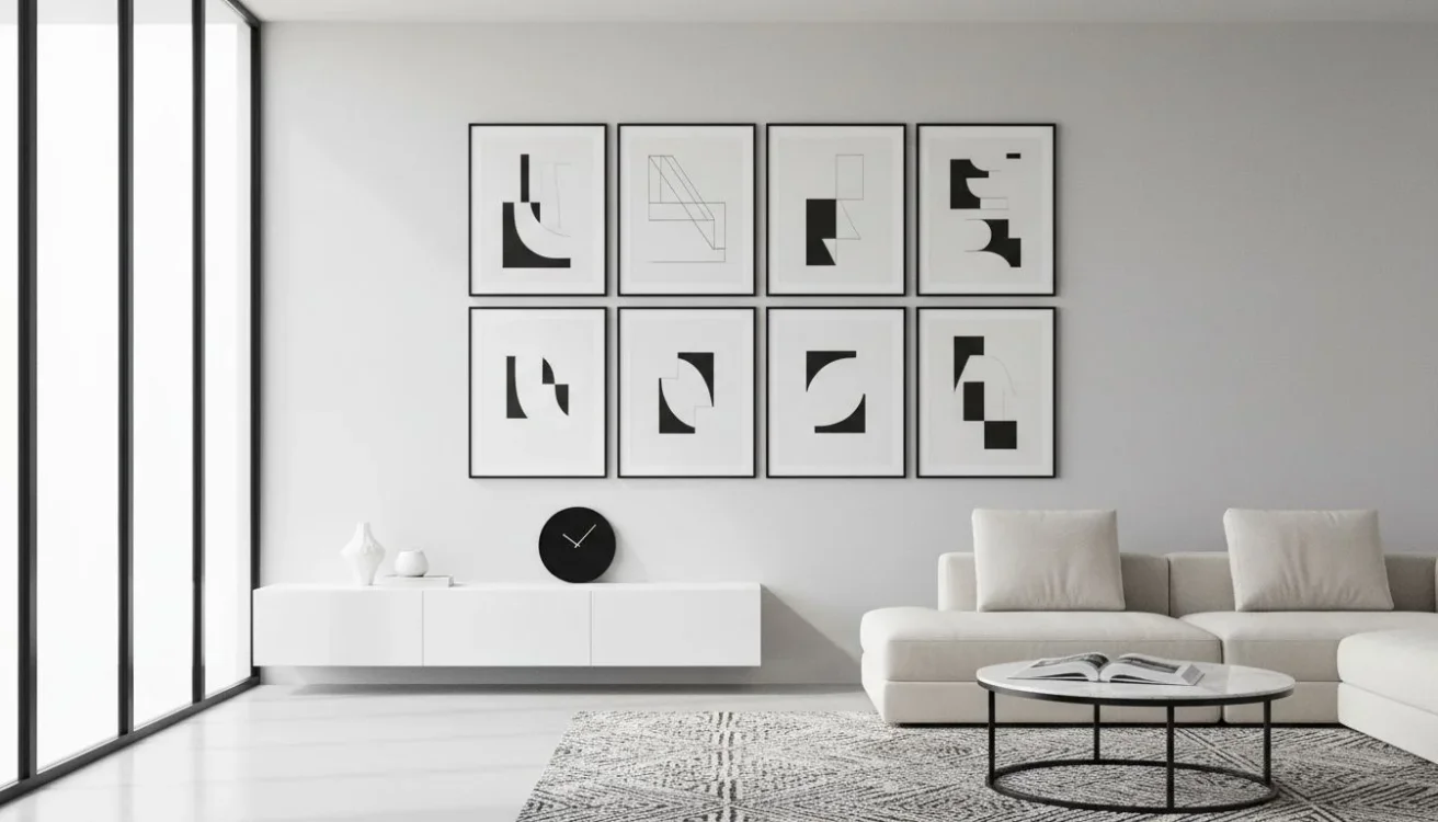
Stick to symmetrical grids and monochrome or two-tone palettes. To achieve a minimalist home decor look, use slim black or white frames with tight gaps for precision.
Farmhouse or cozy: warm wood tones, soft color stories

For farmhouse designs, mix wood frames, linen-white borders, and gentle landscapes. A 3 by 3 over a console or bench brings warmth without fuss.
Boho or eclectic: salon walls, mixed textures, tapestries
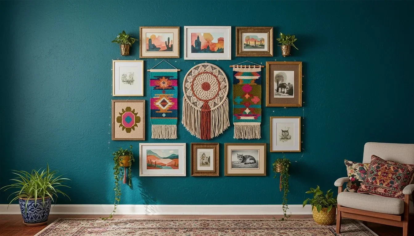
With an eclectic design, you can combine framed art with woven pieces and a plant or two. Keep outer edges aligned so the collage still looks intentional.
Coastal or airy: pale woods, oceanic palettes, negative space

Float images with lots of sky or water. Use pale frames and bigger margins between tiles so the wall feels breezy.
Kids or teen rooms: bold color blocks, name art, switchable themes
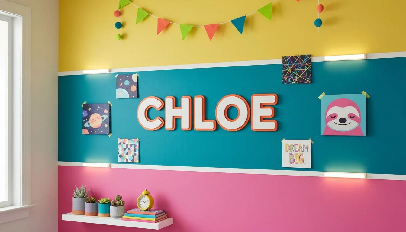
Use bright accent colors and a wall sign with their name. Swap in new art as interests change, thanks to adhesive mounting.
Style mix checklist: how to avoid clashing
Limit frame colors to two. Repeat one accent color every three to five images. Keep outer edges tidy so even eclectic mixes feel curated.
How do you pick images and colors that scale well?
Use high-resolution photos, clear subjects, and simple palettes that read from across the room. Tie colors to existing textiles like rugs and pillows. Alternate busy scenes with images that have negative space so the wall breathes.
High-resolution photos and cropping for large formats
Choose sharp images, then crop deliberately for square or rectangle ratios in the Mixtiles editor. Avoid heavy upscaling. If in doubt, preview at full size in the app.
Color harmony with existing textiles and rugs
Pull two to three hues from your rug or curtains. Echo them in the gallery to lock the room together without repainting.
Visual rhythm: alternating subject scale and negative space
Pair a close-up portrait with a wide landscape, then an abstract with open space. The rhythm keeps large walls from feeling cluttered.
Curating a story: travel, family, nature, and abstracts
Group by theme or palette. A travel wall moves by city or season. A family wall can progress through years. Nature and abstract pair well for calm, artful spaces. For an additional personalized touch, a travel photo book can provide an illustrious appeal to your household.
What’s the easiest way to keep a big wall fresh over time?
Plan a base layout that you can refresh with seasonal sets. Store off-season tiles safely. Keep the wall clean with a dry cloth. Protect prints from harsh light with curtains or sheer shades if you have strong sun.
Seasonal swaps and rotating sets
Keep one box for spring and summer images and one for fall and winter. Swap tiles in minutes since the adhesive is reusable.
Build a “capsule gallery” to mix and match quickly
Create a core set that always stays, like seven tiles in a 4 by 2 layout, then rotate two to five tiles around it for freshness.
Maintenance: dusting, leveling, and light control
Dust with a dry, soft cloth. Avoid water or cleaners. If a tile shifts, lift and realign. Use a level or the Mixtiles app grid overlay for fast straightening.
Cloud albums to reorder favorites in seconds
Save curated albums in Google Photos or iCloud and upload directly when you are ready to refresh. Reorder beloved prints or try a new frame style on the same photos.
Can you design around tricky features like vents, switches, and doors?
Yes. Use asymmetry, smart cropping, and intentional negative space. Treat obstacles as part of the composition. Align to furniture or sightlines rather than the literal center of the wall if needed.
Smart cropping and asymmetry to hide irregularities
Crop images to move the subject away from a switch plate. Shift the composition a few inches off center for better flow.
Use negative space as a design tool
Leave a clear area around vents and thermostats. A deliberate gap looks intentional compared to a crowded edge.
Small fillers: mini frames to bridge gaps
Add two or three smaller rectangles where a full tile would bump into a door trim. Keep their frames and borders consistent with the main set.
When to center vs. when to align to furniture
In open layouts, align to the sofa or dining table rather than the total wall width. Your eye reads the composition in relation to furniture first.
How do you avoid common big wall decor mistakes?
Most issues come from hanging too high, going too small, or mixing too many styles at once. Use the 2/3 rule, keep gaps consistent, and edit your palette. Always preview at scale with tape or in the Mixtiles app before mounting.
- Hang so the visual center is near 57 to 60 inches from the floor, not near the ceiling;
- Size for two thirds of the furniture width, not half, so the wall does not feel empty;
- Limit frame colors to one or two, and keep tile gaps consistent across the whole layout;
- Review from across the room, then fine-tune balance by redistributing darker images before you stick anything up.
Want ready-to-use big wall layout recipes?
Use these five proven formulas to get a polished result on the first try. Pick your tile size, match the gap width, and center the layout to your furniture or fireplace. The measurements below use Mixtiles actual tile sizes for accuracy.
3x3 Grid Recipe
Nine equal squares create a calm, architectural statement. Works above consoles, in entries, and over smaller sofas. Keep gaps a touch wider for a lighter look in compact rooms.
4x3 Grid Recipe
Twelve tiles stretch wider than tall, perfect over sectionals and media units. This is the most versatile recipe for living rooms with standard ceiling heights.
4x4 Grid Recipe
Sixteen squares make a confident focal wall. Use consistent frames and a restrained palette so the field reads as one piece.
5-piece Panorama Recipe
Five vertical rectangles turn a wide photo into a mural-like centerpiece. Keep the middle panel centered on the furniture and let the set breathe with even side margins.
Staircase Diagonal Recipe
Seven to nine tiles arranged in a rising diagonal echo the stair’s angle. Repeat frames and keep gaps tight so the flow reads cleanly from below and above.
Measurements, gap sizes, and placement notes for each recipe
|
Layout |
Tile Size |
Count |
Gap |
Overall WxH |
Recommended Wall Width |
|---|---|---|---|---|---|
|
3x3 Grid |
12.44 in, 31.6 cm |
3 rows x 3 cols |
2 in, 5 cm |
41.32 x 41.32 in, 104.95 x 104.95 cm |
At least 60 in, 152 cm |
|
4x3 Grid |
8.4 in, 21.35 cm |
3 rows x 4 cols |
1.5 in, 4 cm |
38.1 x 28.2 in, 96.77 x 71.63 cm |
At least 72 in, 183 cm |
|
4x4 Grid |
8.4 in, 21.35 cm |
4 rows x 4 cols |
1.5 in, 4 cm |
38.1 x 38.1 in, 96.77 x 96.77 cm |
At least 84 in, 213 cm |
|
5-piece Panorama |
12.44 x 16.44 in, 31.6 x 41.75 cm |
5 vertical panels |
1.5 in, 4 cm |
68.2 x 16.44 in, 173.23 x 41.75 cm |
At least 84 in, 213 cm |
|
Staircase Diagonal |
12.44 in, 31.6 cm |
7 tiles, diagonal |
2 in, 5 cm |
Approx. 41.32 x 41.32 in envelope, 104.95 x 104.95 cm |
Varies by stair run, start 6–8 in above rail |
Notes: Overall sizes are calculated with Mixtiles actual dimensions for accuracy. Keep a 6 to 10 inch margin above furniture. When in doubt, preview in the Mixtiles app before mounting.
Safety, care, and installation basics for large walls
Mixtiles are designed to be lightweight and easy to install. They stick cleanly to flat painted walls and often to light textures, wood paneling, brick, stucco, and wallpaper. Press firmly for a few seconds on very rough surfaces. To install, wipe the wall with a dry cloth, measure, level, and start at the center of the layout.
Clean prints with a dry, soft cloth only. Avoid water or chemicals. If you need to remove a tile, lift upward toward the ceiling to release cleanly. Cover adhesive backs with wax paper when storing to keep dust off.
Why Mixtiles makes big walls easy
Mixtiles turns your photos into framed tiles with adhesive backs that stick and restick without damage. You can also choose canvas tiles, fine art prints, and gallery wall kits that include templates. Order from the website or mobile app, upload from your camera roll, Google Photos, or iCloud, and customize frames, borders, and materials.
If you love to tell bigger stories, consider pairing your wall with a Mixtiles photo book for the coffee table so guests can browse the full album behind your favorite prints.
Big walls stop feeling intimidating when you have a plan. Use these big wall decor ideas and simple sizing rules to create a layout that fits your furniture, your style, and your space. Mix personal photos, canvases, and fine art for a curated look, and keep it fresh with easy swaps over time. With adhesive, repositionable frames from Mixtiles, you can build a polished gallery in minutes, refresh it anytime, and never worry about holes or damage.
Bring your big wall to life today. Explore our collection of wall arts to find the perfect style, and order lightweight frames that arrive ready to stick. No tools, no stress, all wow.
Frequently Asked Questions
What is the simplest way to decorate a big blank wall?
Start with scale. Aim to fill about two thirds of the furniture width, keep the center at 57 to 60 inches high. Choose a grid or triptych, keep gaps consistent, 1.5 to 2 inches. Mock up with tape, then install with adhesive tiles.
How do I accessorize a large wall so it feels layered?
Begin with an anchor, a mirror or large canvas, then layer picture ledges, a lamp, greenery, and a few smaller frames. Repeat two frame tones, vary heights, and leave 6 to 10 inches above furniture so the arrangement feels airy and intentional.
How can I fill a very large wall on a budget?
Use the medium but many approach. Nine to sixteen 8 to 12 inch tiles fill space for less. Mix personal photos with free or public domain art, keep two frame colors, and add a peel and stick mural behind a simple grid for extra scale.
What is the 3-4-5 rule, and does it help with wall layouts?
The 3-4-5 rule is a right angle check from construction. Measure 3 feet on one side, 4 on the other, the diagonal should read 5. Use it to square a gallery before sticking tiles, then keep spacing identical for a crisp result.
What can I use for big walls if I cannot drill holes?
Choose renter friendly adhesives. Mixtiles photo tiles and canvases stick to painted walls and many light textures, then lift cleanly. Build large grids or panoramas without tools, refresh seasonally, and avoid damage fees when you move.
Be the first to know — deals, news & decor ideas.
By clicking you agree to the Terms of Use & Privacy Policy
