
Corner Wall Art Ideas: Transform Awkward Nooks Today
Key Takeaways
- Corners become captivating focal points with wraparound galleries, floor‑to‑ceiling columns, asymmetrical clusters, and shelf plus photo combos.
- Plan first: measure, map, pick a cohesive palette, and right‑size your art; start with 6–9 pieces and build over time.
- Renter‑friendly wins: Mixtiles’ adhesive, repositionable frames let you stick, restick, and move art without tools, nails, or wall damage.
- Room‑by‑room ideas cover living rooms, bedrooms, halls, and stairs, plus clear layout tips for heights, spacing, and balance to get pro results.
Corners are the most overlooked real estate in your home. With the right corner wall art ideas, those empty nooks can become standout moments, without drilling a single hole. In this guide, you will learn how to plan corner layouts, wrap galleries across two walls, and style tight spaces with balance and ease. We will cover room‑specific ideas and renter‑friendly techniques you can install in minutes using Mixtiles’ adhesive, repositionable picture walls. Ready to turn awkward into intentional? Let us begin.
Create your corner gallery in minutes. Upload photos to make custom photo tiles, choose a frame style, and stick them up, no nails and no mess.
Why do corner wall art ideas matter for both small and large rooms?
They turn dead space into design, improve flow, and add balance without adding furniture. You get more visual impact from the same footprint, which is ideal for apartments and large open plans alike.
Corners add depth, movement, and flow
Art that turns a corner pulls the eye through a space. It creates a natural pathway for the gaze, which makes rooms feel connected and cohesive.
Visual continuity: wrapping art around turns extends the sightline and makes rooms feel larger
When frames continue across both walls, your brain reads the area as one expanded surface. This simple trick is why corner layouts feel airy and intentional.
They solve “dead space” without adding furniture
If your corner collects dust or looks bare, art adds height, color, and personality. You get the feeling of a furnished nook without blocking floors or outlets.
Balance for open layouts and odd floor plans
Open plans and angled rooms can feel lopsided. A corner gallery balances heavy elements like TVs or sectional sofas and creates symmetry across a larger area.
Renter‑friendly personalization where drilling is not allowed
Mixtiles stick and restick on painted walls, many textured walls, and even paneling. You can refresh layouts seasonally or when you move, with zero wall damage.
How do you plan a corner gallery wall that looks intentional?
Plan from the corner out. Measure both walls, pick a consistent spacing, choose an anchor image at eye level, and keep a unifying thread like a color palette or frame finish.
Measure and map the corner
Grab quick dimensions for both walls, from the corner to any obstacles like switches, vents, or windows. Note the sightline from entry points and seating so your best images land where eyes naturally fall.
Note wall widths on both sides, sightlines, and any switches or vents
Sketch the corner on paper or your phone. Mark the vertical centerline and eye level. These references will guide your layout as you work around the turn.
Choose the right scale
Pick tile sizes that match wall width and viewing distance. Larger tiles read better from across a room, while smaller tiles fit narrow columns.
Anchor piece first, then build around it with smaller tiles
Place your hero image at about 57 inches to center, then echo its edges across the corner with supporting pieces. This creates a strong focal point that feels grounded.
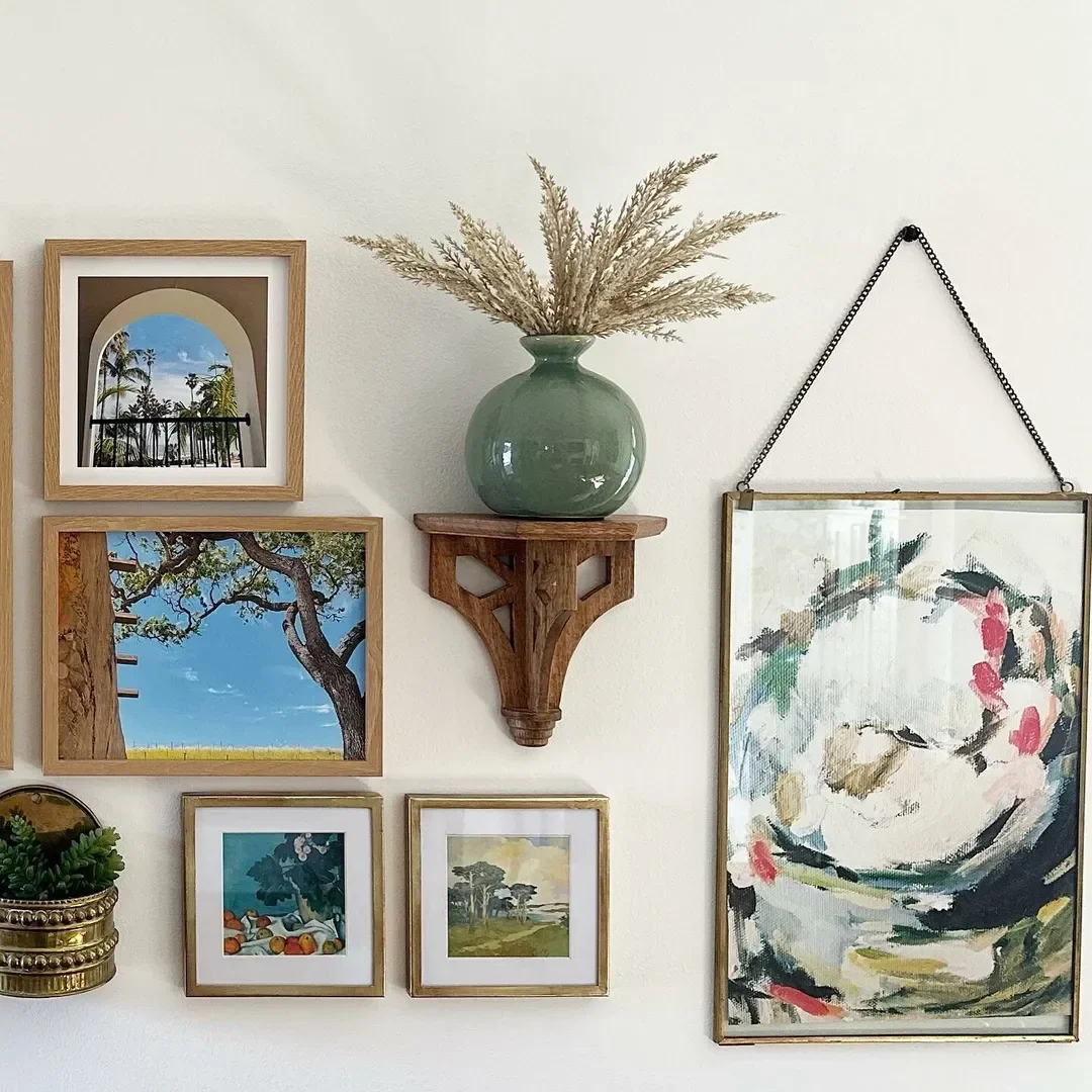
Pick a cohesive theme
Unify with a palette, subject, or frame color. For example, black frames and warm desert tones, or white frames with coastal shots.
Unifying elements: color palette, subject matter, or frame finish
Consistency does not mean identical. Mix close‑ups, landscapes, and typography, as long as they share a mood or color family.
Preview your layout
Lay tiles on the floor and test your spacing. With Mixtiles, you can also stick a first version on the wall, step back, and restick until the flow is perfect.
Use paper templates or plan digitally before sticking tiles
Cut paper squares that match your tile sizes, tape them to both walls, and check balance from different angles. Adjust until the wrap looks seamless.
Quick planning checklist:
- Measure both walls from the corner and mark eye level at about 57 inches to the center of your anchor image;
- Select tile sizes that fit your wall widths and viewing distance, then decide on a consistent gap of 2 to 3 inches;
- Choose a unifying thread like a color palette, subject, or frame finish to tie both walls together;
- Mock up the layout on the floor or with paper templates, then stick and restick Mixtiles until it feels balanced;
- Confirm furniture alignment so the bottom row clears lamp shades, sofa backs, or console tops by a few inches.
What are the best corner wall art ideas for living rooms?

Wrap the gallery across two walls, stack a vertical column, build an asymmetrical cluster, or flank a TV with an L‑shape. These formats add presence without clutter. For more styling inspiration that complements corners, explore our living room wall decor ideas.
Wraparound gallery wall (across two walls)
Let your photo gallery wall grid or cluster continue around the turn so it reads as one composition. This is great behind a sectional or near a windowed corner.
Start with an anchor at eye level, then flow pieces across the corner
Keep spacing identical on both walls and treat the corner like a fold in a book. When edges align, the result feels calm and curated.
Floor‑to‑ceiling column
Short on width, big on height. A slender stack draws the eye up and makes the room feel taller, especially next to plants or a floor lamp.
Stack vertically to draw the eye up and maximize narrow corners
Choose one tile width for repeat rhythm. A consistent column of 8 by 8 or stylish 12x12 canvas prints looks graphic and sleek.
Asymmetrical cluster
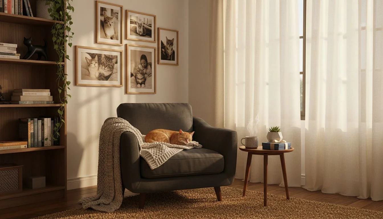
Offset pieces in a loose arrangement for a relaxed look. This works well over an accent chair or side table.
Offset pieces to create organic movement, great above accent chairs or plants
Let one side have a little more visual weight, then counterbalance with a smaller pair around the turn.
Corner media balance
Technology can dominate a living room. Use an L‑shape of photos to soften a TV area and add personality.
Flank a TV with an L‑shaped photo grid to soften tech‑heavy zones
Match the top line of the tiles to the TV’s top or bottom edge. A shared datum line makes everything feel intentional.
Can you combine shelves, plants, mirrors, and photos in one corner?
Yes. Layering photos with ledges, greenery, or a mirror adds texture and depth. Just keep a clear focal point and repeat materials for cohesion.
Ledge shelf plus Mixtiles combo
Install a thin ledge or floating shelf, lean small objects, then float Mixtiles above. The layered look is dynamic without feeling busy.
Lean small objects, then float tiles above for layered depth
Repeat tones between frames and shelf decor. Think black frames, black vase, and one black and white photo for connection.
Corner plants plus photo tiles
Leafy plants soften hard angles. Photos that echo plant greens or earthy hues make the vignette feel cohesive.
Use greenery to soften angles, echo plant tones in your photo palette
Place the tallest plant slightly forward so the gallery peeks through the foliage. The mix feels fresh and lived‑in.
Mirror plus gallery hybrid
A mirror on one wall and tiles on the other bounces light and doubles your display. Perfect for dim corners. If mirrors are your focus, this guide to wall mirrors decor ideas covers sizes and placements that pair well with photo tiles.
Place a mirror on one side and tiles on the other to bounce light and add dimension
Keep frames and mirror finish compatible. For example, brass mirror with warm wood frames, or chrome mirror with crisp white frames.
How should you decorate bedroom, office, hallway, and stair corners?
Scale down in tight rooms and scale up in circulation zones. Use mood to guide imagery and layouts for each space.
Bedroom corners

Keep it calm with soft palettes and balanced spacing. Pastel travel photos, family moments, or abstract textures work nicely.
Nightstand vignette: 3 to 6 tiles in a soft diagonal above a lamp
Follow the lamp height, then step your tiles up and around the corner. The diagonal adds gentle movement.
Cozy nook: chair, throw, and a corner cluster for a reading moment
Position your anchor tile at seated eye level. This keeps the nook intimate and comfortable.
Home office corners

Mix motivational typography with personal wins or travel shots. The corner becomes your productivity zone. For a deeper dive into layouts and styling, see our home office decor ideas.
Motivation wall: typography plus travel memories to energize your desk zone
Align the bottom row with the top of your monitor or shelves. Clean lines reduce visual noise while you work.
Hallway turns and landings

Smaller tiles and tight grids feel curated rather than cramped. Stick to 2 inch spacing for a gallery look in narrow areas.
Tight grids make small corners feel curated rather than cramped
Use lighter imagery to keep the passage bright. Black frames with white borders create crisp definition.
Stair corners

Echo the stair rise with a stepped layout. This guides the eye upward and tells a story as you climb. For more layouts that flow with steps and landings, browse our staircase wall decor ideas.
Stair‑step layout: align tiles with the rise to guide the eye up
Start with your favorite moment at the landing, then step one tile per tread as you move up the wall and around the corner.
Make it renter and dorm friendly. Browse our gallery walls for inspiration. Mixtiles stick and restick on most walls, so you can rearrange anytime without tools, holes, or damage.
How do you lay out art across two walls that meet at a corner?
Keep spacing consistent across both planes, align rows, and use one or two tiles to visually bridge the seam. Treat the corner like a fold, not a barrier.
The seamless wrap
Build your grid as if the walls were flat on the floor. When installed, the matched spacing creates an effortless turn.
Keep spacing consistent on both planes, align rows as if the corner is not there
Stand back from different angles to confirm top and bottom lines stay level across the turn.
Diagonal “bridge” across the seam
Place two tiles nearest the corner at the same height. This pair acts like a hinge for the rest of the layout.
Place two tiles nearest the corner at matching heights to connect the walls visually
After you set the bridge pair, build outward in symmetrical or organic patterns.
Split‑symmetry pairs
Mirror pairs across the corner for a calm, formal look. Great for bedrooms or dining spaces.
Mirror pairs across the corner for calm, balanced symmetry
Use identical frame finishes and similar subjects so the pair reads as one thought.
Waterfall effect
Start high on one wall, then step tiles down and around the turn. This adds movement and energy.
Start high on one wall and step tiles down around the turn for dynamic flow
Keep the step interval consistent, for example 6 inches between centers vertically, for a tidy rhythm.
How high should art hang in a corner, and how much spacing looks right?
Center the main image at about 57 inches, adjust for furniture by 2 to 3 inches, and maintain 2 to 3 inch gaps between tiles on both walls for a clean, gallery feel. Below you’ll find a useful table for calculations and better space layout:
|
Corner width per side |
Recommended layout |
Tile size options |
Suggested piece count |
Spacing between tiles |
|---|---|---|---|---|
|
18–24 in, 46–61 cm |
Vertical column |
8 × 8 in, 8 × 11 in; 20.3 × 20.3 cm, 20.3 × 27.9 cm |
3–6 |
2 in, 5 cm |
|
24–36 in, 61–91 cm |
Mini wraparound |
8 × 8 in, 12 × 12 in; 20.3 × 20.3 cm, 30.5 × 30.5 cm |
6–9 |
2–3 in, 5–7.5 cm |
|
36–48 in, 91–122 cm |
L‑shape gallery |
12 × 12 in, 12 × 16 in; 30.5 × 30.5 cm, 30.5 × 40.6 cm |
9–12 |
2–3 in, 5–7.5 cm |
|
48+ in, 122+ cm |
Statement wrap |
12 × 16 in, 20 × 20 in; 30.5 × 40.6 cm, 50.8 × 50.8 cm |
12–16 |
2–3 in, 5–7.5 cm |
Height guidelines
Use 57 inches to center for your anchor tile. If the layout sits above a sofa or desk, raise the center by 2 to 3 inches so it clears furniture visually.
Aim for about 57 inches from floor to the center of the anchor tile, adjust 2 to 3 inches for sofas or desks
This museum standard keeps art comfortable for standing and seated viewing.
Spacing rules
Choose one gap and repeat it. Two to three inches reads clean and modern, especially across both walls.
Two to three inches between tiles keeps layouts airy, match spacing across both walls
Measure a spacer on painter’s tape so you can repeat it quickly as you build the layout.
Scale and proportion
Smaller corners often look best with fewer, larger tiles. Larger corners can handle full grids or layered clusters with a mix of sizes.
Small corner equals fewer, larger tiles; large corner equals grid or layered cluster
Stand back 8 to 10 feet and confirm your images still read clearly from across the room.
Which photos, frames, and colors create a cohesive corner story?
Pick a hero image, support it with details and textures, unify with 2 to 3 colors, and keep frame finishes consistent or intentionally varied within a narrow range.
Photo selection that pops
Start with a hero shot like a favorite travel photo or portrait. Add close‑ups, textures, and one typographic piece to bring rhythm and rest moments to the gallery.
Mix a hero image, close‑ups, textures, and a subtle pattern or typographic piece
This combination keeps the eye moving while maintaining a cohesive mood.
Color strategy
Repeat 2 to 3 tones across both walls. For example, ocean blues, sand neutrals, and black accents.
Pick 2 to 3 key tones, repeat them to tie both walls together
If your room palette is fixed, edit photos in the Mixtiles app for subtle warmth or coolness so everything harmonizes.
Frame consistency
One finish keeps things serene. Two coordinated finishes can add depth. White frames feel airy, black frames feel graphic, wood adds warmth.
Unify with one finish, or play within a narrow range for intentional variety
If you mix finishes, repeat each at least twice so the variation looks deliberate.
How many pieces do you really need, and where should you start?
Use your corner width to guide piece count. Begin small, then expand as your story grows. Mixtiles make it easy to add tiles later and restick the layout.
Starter sets
Six tiles are perfect for tight corners, bedroom nightstands, or a column beside a plant. Pick one size for a crisp rhythm.
Six tiles: perfect for tight corners or above accent chairs
Try 8 by 8 squares for compact impact and easy spacing.
Growth sets
Nine tiles create a full wraparound for living rooms. Build a 3 by 3 that turns the corner with three per side.
Nine tiles: ideal wraparound for living room corners
Place three tiles on one wall, three bridging the turn, and three on the other wall for balance.
Statement sets
Twelve to sixteen tiles make a dramatic stair step or floor‑to‑ceiling composition. Use larger tiles for clarity from a distance.
Twelve to sixteen tiles: stair‑step or floor‑to‑ceiling arrangements for maximum impact
Consider 12 by 16 rectangles for a dynamic vertical flow that still aligns neatly across the corner.
What common mistakes should you avoid with corner wall decor?
Do not crowd the seam, ignore furniture height, or shift spacing between walls. Plan first, then stick and restick until the balance feels effortless.
Crowding the corner
Leave a small pocket of breathing room around the seam. Negative space clarifies the composition and reduces visual tension.
Leave negative space so the layout can breathe
Two inches of free wall at the corner reads cleaner than frames pressed tight to the edge.
Ignoring furniture height
Coordinate with sofas, headboards, consoles, and lamps. Bottom rows should clear these lines for a neat relationship.
Align with sofa backs, headboards, or console tops for cohesion
Shared horizontal lines make the gallery feel integrated with the room, not floating randomly.
Mismatched spacing across the turn
Keep gaps identical on both walls. If the left side is 2 inches and the right is 3, the break will show immediately.
Keep gaps uniform on both walls to prevent visual breaks
Use a spacer so every gap repeats exactly, including the tiles closest to the corner.
Skipping the plan
Even with repositionable tiles, a quick mockup saves time. Plan your story, then tweak freely.
Map it out first, Mixtiles are repositionable, so adjust until it is perfect
If a photo clashes, swap in a Fine Art Print or a Wall Sign. Mixtiles offers both so you can mix personal photos and licensed art.
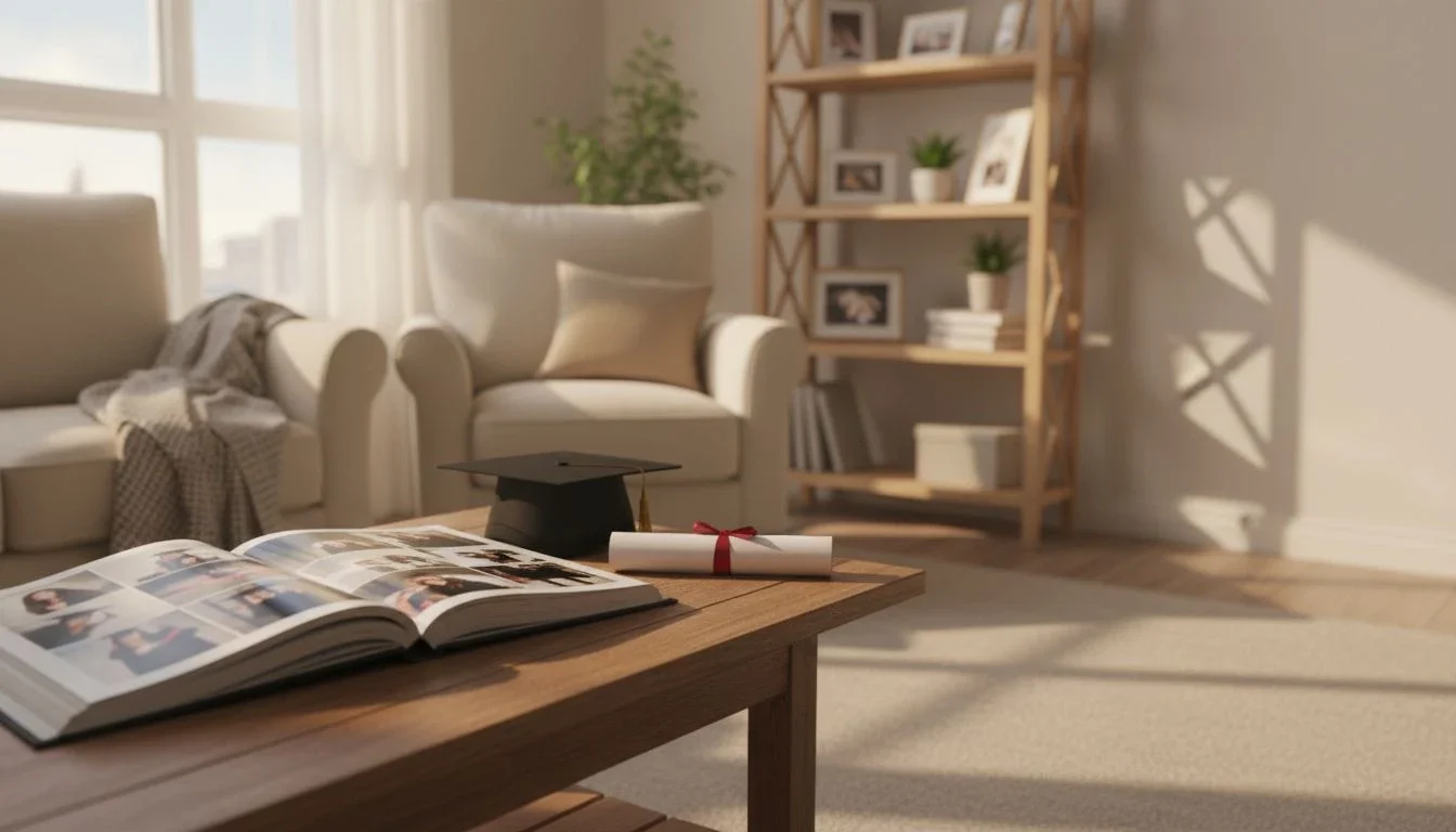
Corner wall art ideas turn blank nooks into beautiful, functional focal points, no drill required. By planning your layout, choosing cohesive imagery, and using renter‑friendly frames, any corner can look curated in minutes.
Whether you prefer a calm wraparound gallery or a bold floor‑to‑ceiling column, Mixtiles makes it effortless to create, rearrange, and grow your display as your style evolves. For even more corner wall decor ideas, try mixing personal photos with Mixtiles Fine Art Prints to build a story that is uniquely yours.
Bring your corner vision to life today. Upload your photos to create beautiful canvas prints or framed photos, and stick up your gallery. Restick anytime as your space grows and changes.
Frequently Asked Questions
How do you style a corner wall with art?
Start with a plan. Anchor a hero tile at about 57 inches to center, keep 2 to 3 inch gaps. Choose a wraparound gallery, a vertical column, or an asymmetrical cluster. Repeat a tight palette and frame finish. With Mixtiles, stick and restick until balance feels right.
What wall art trends look great in corners right now?
Clean wraparound grids, calm neutrals, black and white photography, botanical prints, and subtle typography feel fresh. Mixed sets that combine personal photos with fine art are popular. Repositionable frames that allow seasonal refreshes are trending too, perfect for renters and dorms.
How can I fill an awkward corner without clutter?
Use verticality and a tight rhythm. Try a floor to ceiling column, a mini wrap that spans both walls, or a slim shelf plus photo combo. Keep 2 to 3 inch spacing, echo room colors, and clear furniture lines. Mixtiles install tool free in minutes.
What is the best way to place art right in a corner?
Mark a light vertical guideline 1 to 3 inches from the corner on one wall. Align your first column to that line, then mirror spacing on the other wall. Keep rows level across both planes. Test with Mixtiles, then restick for perfect alignment.
Be the first to know — deals, news & decor ideas.
By clicking you agree to the Terms of Use & Privacy Policy