
How to Create a Gallery Wall: Layouts & Proportion Made Easy
Key Takeaways
Before you start hanging art, skim these key points so your wall looks good the first time.
- Plan on the floor or with paper templates, anchor with your largest piece, and keep consistent spacing for a polished look;
- Choose a layout (grid, organic, row, shelf-ledge, stair-step) that suits your wall and story; unify with a color palette or frame style;
- Hang at eye level, mind balance and flow, and fix common mistakes with simple spacing and placement tweaks;
- Save your walls: Mixtiles’ adhesive, repositionable frames make gallery walls fast to build, easy to adjust, and renter-friendly.
Love the look, dread the holes? This guide shows you how to create a gallery wall that looks designer-level without the stress. From planning layouts and spacing to choosing art and frames, we’ll cover everything; plus show you how Mixtiles’ adhesive, repositionable photo tiles make building, tweaking, and expanding your gallery wall effortless. No nails, no damage, all wow.
Ready to get started now? Open the Mixtiles app or visit Mixtiles.com to upload photos and preview layouts in minutes.
What exactly is a gallery wall, and what makes a great one?
A gallery wall is a curated arrangement of art and photos that turns a blank wall into a focal point. The best gallery walls feel cohesive, balanced, and evenly spaced, so every piece can shine and the whole composition looks intentional at a glance.
Definition and purpose
Think of a gallery wall as a collage you hang: a curated grouping of art, family photos, and objects that add character, texture, and story to your space. Whether you’re decorating a living room, dining room, home office, or bedroom gallery, it’s a great way to bring your house to life and create a statement that feels personal.
The three pillars of a great gallery wall
Cohesion, balance, and spacing. A simple color palette or repeated frame finish ties different sizes and art pieces together. Balanced size, color, and visual weight keep the eye moving in a pleasant way. Consistent spacing, kept tight and even, makes everything look clean and professional every time.
Where in your home does a gallery wall work best?
Gallery walls can work in almost any room. Choose a place with enough wall space, a clear focal point, and good everyday visibility so your artwork gets enjoyed, not ignored.
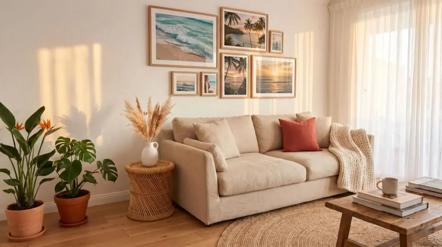
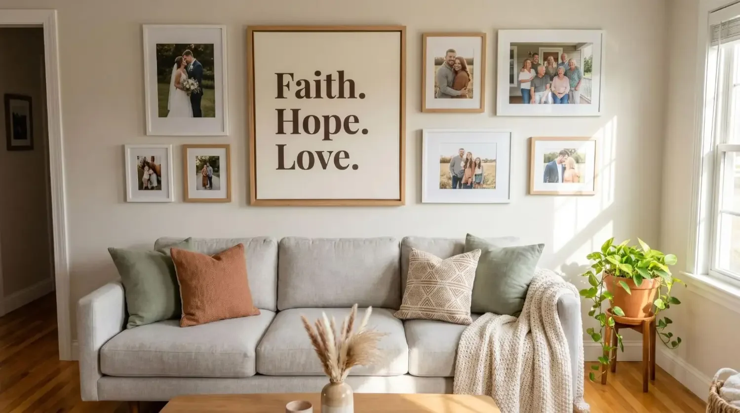
Living room focal walls

Above the sofa, around the TV, or behind a console are top choices for a living room gallery. Keep the total width to roughly two-thirds the sofa length, and hang art so the center sits near eye level. If there’s a TV, place pieces around it so the screen feels integrated rather than isolated.
Hallways and entryways

Long walls love order. Try one long row at a consistent level or a neat grid that brings rhythm to the space. These areas benefit from matching frames and a black and white photo set or a limited color palette so the wall looks tidy rather than busy.
Staircases and landings

Follow the rise of the stairs with an angular arrangement. Keep the middle line parallel to the handrail, placing pieces around that diagonal. Use a measuring tape to keep the step between frames consistent, and vary sizes for movement without losing order.
Bedroom, nursery, office

In a bedroom, calm is key. Softer colors and symmetric rows above the headboard look good and feel restful. In a nursery, mix playful art and family photos you can swap as kids grow (Mixtiles make this easy without nails). For a home office, try a grid near your desk for a clean look or an organic salon wall as a motivating mood board.
How do you plan your layout?
Lay out your gallery on the floor or map it with paper templates on the wall. Start with your largest piece as the anchor, keep a consistent gap, and aim for eye level, then adjust until the balance feels right.
Two planning methods that always work
Floor layout: Measure the wall’s width and height, then tape off that area on your floor with painter’s tape. Arrange your framed pieces inside the taped box, move them around, and photograph the best layout for reference.
Paper templates: Trace frames on kraft paper, cut them out, and tape them to your wall. Slide templates until the spacing and flow feel right, then use them as guides for placement.
Start with your anchor
Place the largest piece or most meaningful photo first. You can put it in the middle or just off-center so the eye travels around the gallery. This starting point makes other choices easier: build outward with medium pieces, then fill small gaps with smaller photos or prints.
Spacing and alignment rules
Keep the gap between frames at about 2–3 inches (5–8 cm) for a polished look. Aim to center the overall composition at eye level, around 57–60 inches (145–152 cm) from the floor. If art hangs above a sofa or console, keep the lower edge about 6–8 inches (15–20 cm) above it so everything feels connected.
Balance the visual weight
Distribute large or dark pieces diagonally so one side doesn’t feel heavy. Mix vertical and horizontal orientations. If a small but bold picture feels visually heavy, place it lower or near a larger light piece to balance the view.
Which gallery wall layout should you choose?
Pick a layout that matches your room and personality: neat grids for modern order, organic salon walls for eclectic charm, rows for hallways, shelf-ledge displays for easy swaps, stair-step arrangements for vertical movement, or modular tiles for the easiest way to create a gallery.
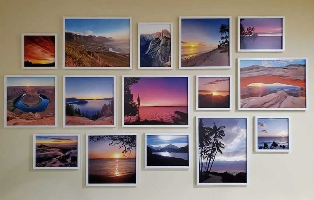
Clean grid
Identical frames and sizes line up into a modern, calming grid. This looks especially good with uniform tiles or matted frames and a tight color palette. It’s a best-in-class option when you want symmetry and a professional finish.
Classic row (one long line)
A single row at eye level is perfect in hallways or above a buffet in the dining room. Matching sizes make the line read as one continuous statement and keep things looking clean. For help choosing proportions that suit your space, check out our gallery wall size guide.
Organic salon wall
Mix different sizes and frames, but repeat a couple of finishes (say black and natural wood) so the collection still feels unified. Place pairs or mini clusters as rhythm points around the larger anchor piece.
Shelf-ledge display
Picture ledges let you lean art and layer frames without nails. It’s a great way to try new combinations and swap seasonally. Add a small mirror or object for dimension.
Stair-step composition
Follow the slope of the stairs. Use smaller frames near the top and larger ones near the bottom to respect visual gravity, and keep the imaginary center line parallel to the handrail.
How do you choose art, photos, and frames that feel cohesive?
Choose a thread (color palette, subject, or frame finish) and repeat it. Mix mediums for depth, pair a hero piece with supporting art, and keep edits consistent so photos look like they belong together.
Find your thread
Pick two or three frame finishes, a color palette (neutrals plus one accent), or a theme like travel, family photos, or black and white pictures. This simple rule brings lots of different pieces into one harmonious design.
Mix mediums for dimension
Combine photos, prints, and wall hangings or small 3D objects. A mirror can also add light. Just make sure heavier pieces are lower and close to studs or use shelves if needed.
Curate like a pro
Let one hero artwork set the tone, then support it with secondary pieces that repeat shapes or colors. Step back often and ask: does it look balanced from the middle of the room?
Photo curation tips
Vary crops and orientations for interest. A set of black and white photos can make a new gallery wall feel instantly cohesive. Keep editing consistent so skin tones, light, and mood align.
Frame strategy
All-matching frames create a refined order; a thoughtful mix adds warmth. Mixtiles frames and canvas prints come in styles that complement modern, classic, or organic looks, so you can choose what feels like you.
Want a head start? Explore Mixtiles Gallery Wall Kits with ready-made layouts and templates. Just stick, align, and enjoy.
What are the exact measurements you should follow?
Aim for eye-level centering (57–60 inches), 6–8 inches above furniture, and 2–3 inches between frames. Scale your overall width to roughly two-thirds of the furniture below or 50–75% of the wall span.
Quick Measurement Guide (Imperial and Metric)
|
Guideline |
Imperial |
Metric |
Notes |
|---|---|---|---|
|
Eye-level center height |
57–60 in |
145–152 cm |
Adjust slightly for tall ceilings or household height. |
|
Gap above sofa/headboard |
6–8 in |
15–20 cm |
Keeps composition connected to furniture. |
|
Spacing between frames |
2–3 in |
5–8 cm |
Smaller frames can sit closer; keep it consistent. |
|
Coverage width above furniture |
≈ 2/3 furniture width |
≈ 65–75% furniture width |
Ideal proportion for sofas and consoles. |
|
Small tile (popular square) |
≈ 8 × 8 in |
≈ 20 × 20 cm |
Great for grids and modular clusters. |
|
3 × 3 grid footprint (with 2.5 in gaps) |
≈ 28.5 × 28.5 in |
≈ 72 × 72 cm |
Fits nicely above many 72–84 in sofas. |
Scale to wall size
On long walls, break the run into clusters or a repeating rhythm so it doesn’t feel endless. Above furniture, aim for about two-thirds the furniture width. For a small room, fewer pieces with tighter spacing often look better than lots of different sizes spread too far apart.
Can you build an eclectic gallery wall that still looks intentional?
Absolutely. Limit your palette, repeat a couple of frame finishes, and balance sizes and colors diagonally. The result feels curated, not chaotic.
The “mismatch to match” formula

Pick two to three frame tones and keep them repeating across the wall. Combine wood with black or white for a simple, good-looking mix. Repeat colors in at least two places so the eye can connect them.
Visual gravity

Place heavier or darker pieces lower and lighter pieces higher for a sense of stability. If the middle feels empty, shift a strong piece toward the center as a focal point and rebuild smaller pieces around it.
Evolving walls
You don’t need to finish in one go. Start with four to six photos, keep your gap rule, and expand over time. With Mixtiles, you can add a new gallery piece anytime and re-balance easily without nails.
What are the most common mistakes, and how do you fix them?
Mistakes usually come down to spacing, height, and a missing anchor. Tighten gaps, drop the center to eye level, and add a hero piece; most walls snap into place with those three moves.
Gaps that are too wide or uneven
Bring frames closer to 2–3 inches and use a spacer to keep them even. With adhesive tiles, you can correct this in seconds.
Hanging everything too high
Lower the composition so the visual center lands around 57–60 inches. Above furniture, relate to the top line of the sofa or console and keep 6–8 inches of separation. For a full step-by-step layout reference, see our guide on how to hang a gallery wall.
No focal point
Introduce a larger print or a bold piece near the middle or just off-center. This single change often makes the whole gallery look intentional.
Chaotic frame mix
Standardize the mats or repeat one frame color more often. Even in an organic layout, a consistent frame repeated three times can bring order.
Overcrowding long walls
Break into clear clusters with breathing room, or choose a precise row or grid. Sometimes removing one small piece is the simplest way to help the rest look better.
How do you design your gallery wall in minutes with Mixtiles?
Upload photos, preview layouts, and pick your style in the Mixtiles app or on the site. Then peel, stick, and fine-tune at eye level. Fast, fun, and foolproof.
Plan it in the app or on the site
Select your photos, try black and white or color edits, and preview rows, grids, or organic layouts. You’ll see how your wall art will look before you ever touch the wall.
Choose your set and layout
Start with 6, 9, or 12 tiles for a clean grid or a living room gallery. If you like to experiment, go organic and add new pieces as your collection grows.
Place and tweak, risk-free
Peel, stick, and adjust until the spacing feels right. If you change your mind tomorrow, lift gently and re-stick: your walls stay damage-free.
Why Mixtiles works for every room
Lightweight materials, clean frames, and consistent sizes mean you can hang a gallery in a bedroom, hallway, dining room, or home office without tools. Fast shipping and easy installation let you create a gallery wall any time inspiration strikes.
Need room-by-room inspiration to get started?
Use these quick ideas as flexible templates. Adjust sizes, spacing, and palettes to match your style and wall space.
Living room
Try a 3 × 3 or 4 × 3 grid above the sofa as a bold statement. If you have a TV, place pairs of photos on either side to integrate the screen into the gallery so it doesn’t dominate the view.
Hallway
Line a single row at eye level from entry to end. Matching frames and a neutral palette keep the corridor looking clean and bright.
Staircase
Mirror the rise with a diagonal center line. Place medium pieces along that line and fill with small photos above and below for a dynamic but orderly look.
Bedroom
Two rows of soft-toned photos above the headboard create a calm focal point. A consistent frame finish helps everything feel serene.
Nursery and kids’ rooms
Mix playful illustrations with family photos. As interests change, swap tiles out. No nails, no patches, just fresh artwork that grows with them.
Creating a gallery wall is equal parts planning and play. Choose a layout that suits your space, set a clear spacing rule, and build around a strong anchor for balance. With Mixtiles’ adhesive, repositionable frames, you can design, install, and refine your gallery wall in minutes. No nails, no damage, all confidence.
Thank yourself later: start your gallery wall today at Mixtiles.com. Upload photos, choose your style, and bring your blank wall to life.
Frequently Asked Questions
What’s the golden rule for a great gallery wall?
Keep it cohesive, balanced, and evenly spaced. Repeat a frame finish or color palette, anchor with your largest piece, and maintain 2–3 inch gaps. Center the composition near eye level (57–60 inches) and, above furniture, keep the lower edge roughly 6–8 inches from the top.
How do I plan a gallery wall layout step by step?
Mock it up on the floor or with paper templates. Place your anchor first, build outward with medium pieces, then fill gaps with smaller ones. Keep spacing consistent, photograph options, and adjust for balance.
What does the 2/3 rule mean above furniture?
Your artwork (or grouping) should span about two-thirds the width of the furniture below. Example: Above a 90-inch sofa, aim for roughly 60 inches of total art width. Pair this with a 6–8 inch gap above the furniture for comfortable, connected proportions.
How can I create a gallery wall on a budget?
Use phone photos, mix free printable art, and thrift or repurpose frames. Choose a simple palette (black-and-white unifies cheaply) and start small, expanding over time. Adhesive, lightweight options like Mixtiles cut tool, hardware, and wall-repair costs: perfect for renters and quick refreshes.
Be the first to know — deals, news & decor ideas.
By clicking you agree to the Terms of Use & Privacy Policy